Stat-Ease Blog

Categories
Stat-Ease - Here for You
Stat-Ease is here for you during these trying times. We can help you with your design and analysis of experiments, whether at home or in the lab. Please reach out if you have a question, sales@statease.com
A summary of information that may be important to you
Access to Design-Expert® software while working at home:
- Download a free trial at www.statease.com/trial/. (Used your DX12 trial already? Ask us!)
- Network users - temporarily bring a license home by checking out a roaming license from your server. Go to www.statease.com/docs/v12/network-installation/#roaming-licenses for more information.
- Need Technical Assistance? Email support@statease.com
Access to FREE educational materials:
- Elearning - learn DOE on demand at the Stat-Ease Academy. Go to www.statease.com/training/academy/ to sign up.
- Hear from our DOE experts: visit our Webinars page at www.statease.com/webinars/ and our YouTube channel, www.youtube.com/channel/UCzf_5--odkQ4w25m5r09bWA
- Dive into Design-Expert software: Tutorials (www.statease.com/docs/v12/tutorials/)
2020 European Conference: Our conference (www.statease.com/events/doe-user-meetings/8th-european-doe-meeting/) is being re-imagined into an online opportunity that will be accessible to our global audience!
To receive information by email, go to www.statease.com/publications/signup/ and signup for our email list.
If you have other needs while transitioning to a new work setup, or an Academic online learning environment, please contact sales@statease.com
Design-Expert Favorite Feature: Sharing the Magic of the Model!
The situation: You have successfully run an experiment and analyzed the data. The results include a prediction equation with a high predicted R-squared that will be useful for many purposes. How can you share this with colleagues?
The solution: Design-Expert® software has a little-known but useful “Copy Equation” function that allows you to export the prediction equation to MS Excel so that others can use it for future work, without needing a copy of Design-Expert software. The advantage of using this function is that it brings in all the essential significant digits, including ones not showing on your screen. This accuracy is critical to getting correct predictive values.
- Go to the ANOVA tab for the response. Find the Actual Equation, located in the lower right corner by default.
- Right-click on the equation and select Copy Equation.
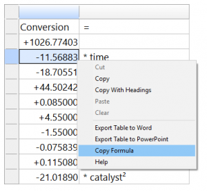
3. Open Excel, position your mouse and use Ctrl-V to correctly paste the formula into Excel (Ctrl-V allows the spreadsheet functionality to work.)
4. As shown in the figure (coloration added within Excel), the blue cells allow the user to enter actual factor settings. These values are used in the prediction equation, with the result showing in the yellow cell.

You can also view this process in this video.
Good luck with your experimenting!
Four Questions that Define Which DOE is Right for You
Do you ever stare at the broad array of DOE choices and wonder where to start? Which design is going to provide you with the information needed to solve your problem? I’ve boiled this down to a few key questions. Each of them may trigger more in-depth conversation, but the answers are key to driving your design decisions.
- What is the purpose of your experiment? Typical purposes are screening, characterization, and optimization. The screening design will help identify main effects (it’s important to choose a design that will estimate main effects separately from two-factor interactions (2FI)). Characterization designs will estimate 2FI’s and give you the option to add center points to detect curvature. Optimization designs generally estimate non-linear, or quadratic effects. (See the blog “A Winning Strategy for Experimenters”.)
- Are your factors actually components in a formulation? This leads you to a mixture design. Consider this question – if you double all the components in the process, will the response be the same? If yes, then only mixture designs will properly account for the dependencies in the system. (Check out the Formulation Simplified textbook.)
- Do you have any Hard-to-Change factors? An example is temperature – it’s hard to randomly vary the temp setting higher and lower due to the time required to stabilize the process. If you were planning to sort your DOE runs manually to make it easier to run the experiment, then you likely have a hard-to-change factor. In this case, a split-plot design will give a more appropriate analysis.
- Are your factors all numeric, or all categoric, or some of each? Multilevel categoric designs work better with categoric factors that are set at more than 2 levels. A final option: optimal designs are highly flexible and can usually meet your needs for all factor types and require only minimal runs.
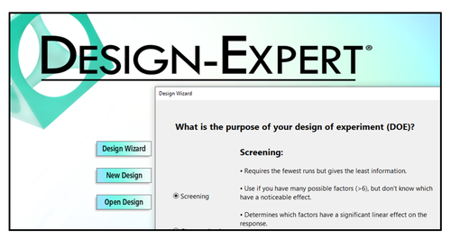
These questions, along with your budget for number of runs, will guide your decisions regarding what type of information is important to your business, and what type of factors you are using in the experiment. Conveniently, the Design Wizard in Design-Expert® software (pictured left) asks these questions, guiding you through the decision-making process, ultimately leading you to a recommended starting design.
Give it a whirl – Happy Experimenting!
Energize Two-Level Factorials - Add Center Points!
Two-level factorial designs are highly effective for discovering active factors and interactions in a process, and are optimal for fitting linear models by simply comparing low vs high factor settings. Super-charge these classic designs by adding center points!
(Read to the end for a bonus video clip!)

There is an underlying assumption that the straight-line model also fits the interior of the design space, but there is no actual check on this assumption unless center points (the mid-level) are added to the design. Figure 1 illustrates how the addition of center points helps you detect non-linearity in the middle of the experimental space.

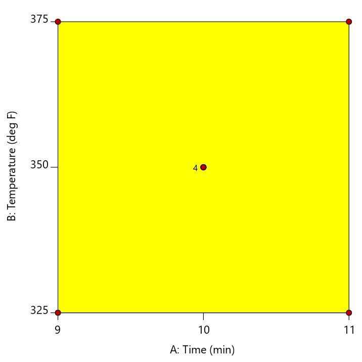
A center point is located at the exact mid-point of all factor settings. The example in Figure 2 shows a cookie baking experiment where the center point is replicated four times at the mid-point of 10 minutes and 350 degrees.
Multiple center points (replicates) should be randomized throughout the other experimental conditions to get an adequate assessment of whether the actual values measured at this point match what is predicted by the linear model. This is called a test for curvature. If the curvature test is significant, this is considered evidence that a quadratic or higher order model is required to model the relationship between the factors and the response. If the curvature test is not significant, then it is okay to assume that the linear model fits in the middle of the design space.
In Design-Expert® software, version 11, the curvature test is placed in front of the ANOVA when you have included center points in the design. This immediately shows you if the model is significant, and if the curvature is significant. As illustrated by the screen shot below (Figure 3), advice is provided to guide your next steps.
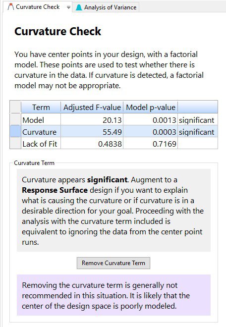
New to DX11, is the “Remove Curvature Term” button. If curvature is significant and you click on this button, then the regression modeling is done by using all the data, including the center points. Because the actual center points are not sitting in the middle of the design space, it is highly likely that the resulting model will be poorly fit and the lack of fit statistic will be significant. Then, click on “Add Curvature Term” to put the curvature effect back into the model, thus accounting for the information in the middle of the design space.
Ultimately, if curvature is significant, the recommendation is to augment the design to a response surface design to better model the relationship between the factors and the response. If curvature is NOT significant, then proceeding with the analysis is acceptable.
For further details on curvature, check out the DOE Simplified textbook, or enroll in an upcoming Modern DOE for Process Optimization workshop.
Bonus: Check out Mark’s 1-minute video on this topic: MiniTip 2 - Center points in factorials
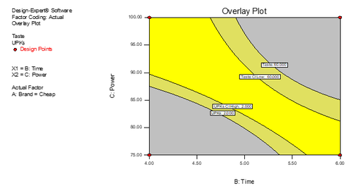
Adding Intervals to Optimization Graphs
Design-Expert® software provides powerful features to add confidence, prediction, or tolerance intervals to its graphical optimization plots. All users can benefit by seeing how this provides a more conservative ‘sweet spot’. However, this innovative enhancement is of particular value for those in the pharmaceutical industry who hope to satisfy the US FDA’s QbD (quality by design) requirements.
Here are the definitions:
Confidence Interval (CI): an interval that covers a population parameter (like a mean) with a pre-determined confidence level (such as 95%.)
Prediction Interval (PI): an interval that covers a future outcome from the same population with a pre-determined confidence level.
Tolerance Interval (TI): an interval that covers a fixed proportion of outcomes from the population with a pre-determined confidence level for estimating the population mean and standard deviation. (For example, 99% of the product will be in spec with 95% confidence.)
Note that a confidence interval contains a parameter (σ, μ, ρ, etc.) with “1-alpha” confidence, while a tolerance interval contains a fixed proportion of a population with “1-alpha” confidence.
These intervals are displayed numerically under Point Prediction as shown in Figure 1. They can be added as interval bands in graphical optimization, as shown in Figure 2. (Data is taken from our microwave popcorn DOE case, available upon request.) This pictorial representation is great for QbD purposes because it helps focus the experimenter on the region where they are most likely to get consistent production results. The confidence levels (alpha value) and population proportion can be changed under the Edit Preferences option.