
Stat-Ease Blog

Categories
How to de-alias a foldover to reveal the true two-factor interactions
This is part 3 of an adaption from Mark Anderson’s 2023 YouTube webinar, "Do's & Don'ts for Screening Process Factors."
Resolution IV designs that detect two-factor interactions
In our training courses, we teach screening using a 9-factor, 20-run example for an arc-welding experiment. This case deploys a Resolution IV Minimum-Run Screening design. The significant effects are shown below:
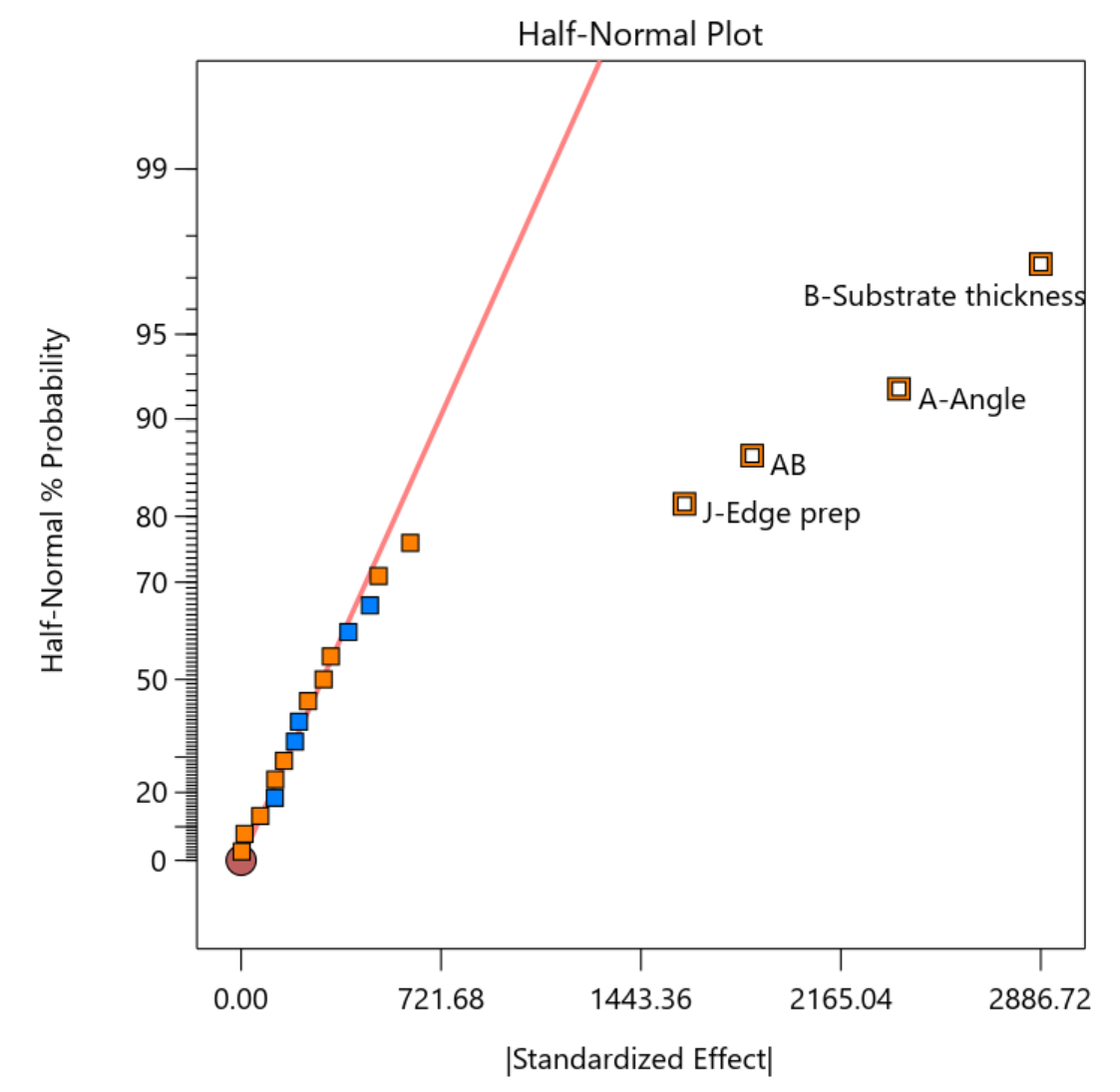
Figure 1: Half-normal plot of effects for arc-welding screening experiment
This experiment reveals a significant two-factor interaction term (AB). The half-normal plot also indicates significance for both parents of AB—factors A and B. A resolution IV design aliases main effects only with three-factor or higher order effects that rarely occur, thus it is save to conclude in this case that factors A and B do indeed create main effects. But you must remain wary about the AB term. Here’s the catch: with resolution IV designs, two-factor interactions are aliased with other two-factor interactions. As shown in Figure 2, in this case, AB is aliased with eight other two-factor interactions.
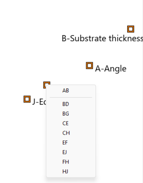
Figure 2: Aliasing of the AB interaction with other two-factor interactions
The reason AB is listed on the half-normal plot instead of the other options is simply because the list is alphabetical. Perhaps it makes sense to the process experts that AB is indeed the proper choice. Or perhaps you feel confident that because both A and B were correctly identified, the interaction between the two is the most logical choice. But it is possible to have an interaction present even when the main effect terms do not show up as significant. Anyone who has ever encountered our software’s hierarchy warning has seen this phenomenon in action.
The consequence of getting this wrong in a screening design is that you may miss factors that are indeed consequential. For example, in the above list if CH was the correct interaction rather than AB, then you would miss carrying C and H forward from the screening design.
You can use a semifold design to validate the AB alias. This will add 50% more runs but will more confidently ensure the likelihood that you’re not missing something important from your screening effort. Figure 3 shows how to do so with Stat-Ease software.
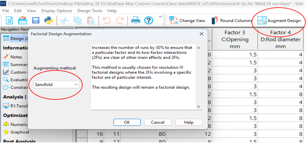
Figure 3: Augmenting a resolution IV design via a semifold
In the next menu, selecting either A or B to fold on will be best given the goal ofresolving the AB interaction. In this case, a good choice will be J+ Edge Prep at the high level), because this factor at the plus setting generated significantly higher tensile strength for the welds. Figure 4 shows these entries in the semifold dialog box.
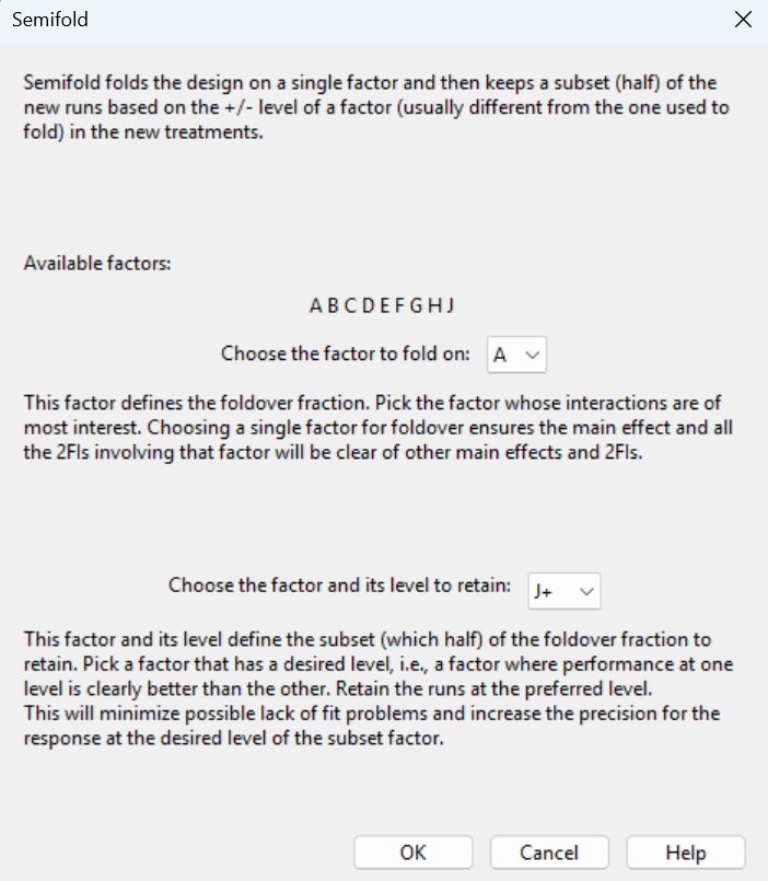
Figure 4: Specifying how to do the semifold
Inspecting the resulting alias structure shown in Figure 5, the semifolded design cleanly identifies not only main effects, but all the two-factor interactions involving factor A, including the AB term of interest.
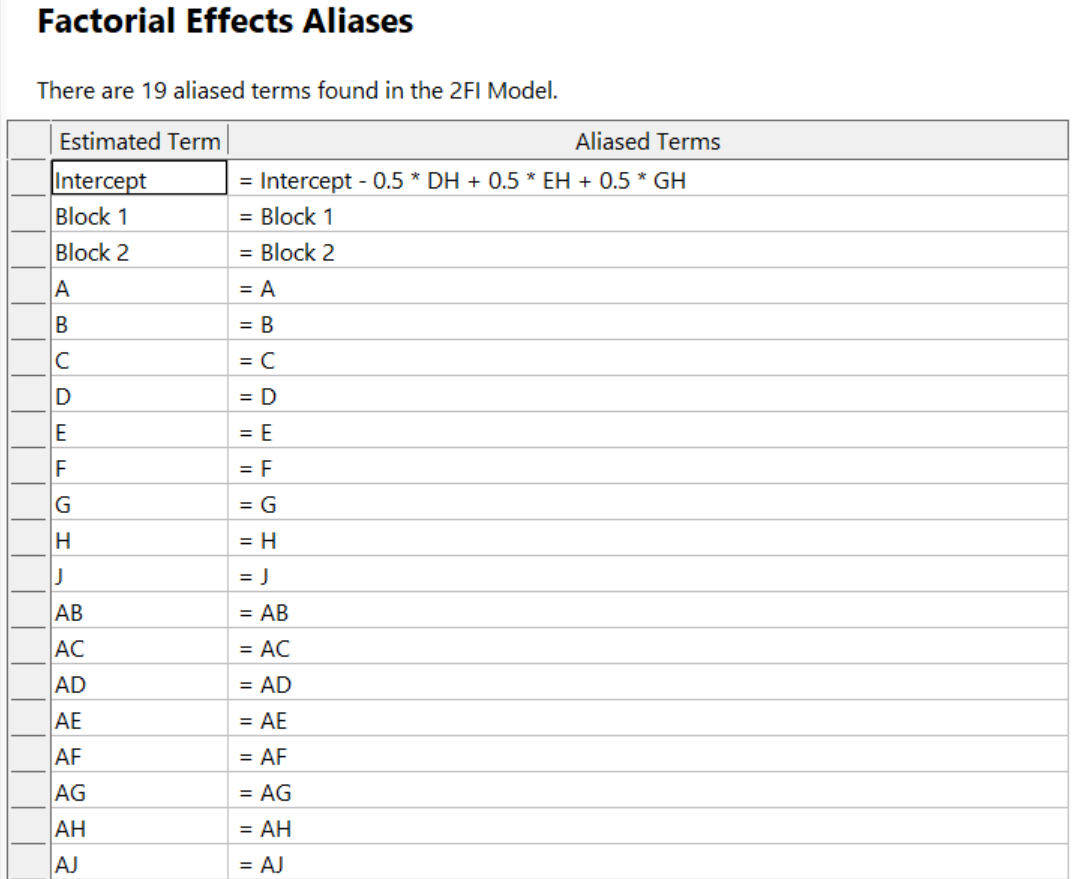
Figure 5: Alias structure after doing the semifold
The semifold increased the original 9 factor, 20 run design to 30 runs. Another option would be to use a resolution V design from the start to ensure all two-factor interactions could be estimated clear of any troublesome aliasing, for example, the minimum-run resolution V characterization design with 46 runs. So, for screening, there is a clear efficiency advantage to using resolution IV designs, even if there is an interaction term worthy of investigating further using a semifold augmentation.
For all DOE’s, it is important to evaluate a design for power–the ability of the design to identify factors impacting responses by a selected magnitude. This is mainly driven by the number of runs. For example. If you’re running a seven-factor resolution IV screening design to look for factor effects of 1.5 standard deviations, you will need at least 19 runs to have acceptable power. The standard geometric resolution IV design has only 16 runs and the minimum run screening design has only 14 runs. Both approaches will require adding a few more runs to satisfy the power requirements.
For fractional factorial designs–especially screening designs–it is also important to evaluate the design for aliasing. The lower the resolution, the more consequential the aliasing. The augmentation approaches discussed in the post can be helpful in addressing tricky aliasing issues that could otherwise limit the success of your screening effort.
When things don't go as planned, whether you've inherited a resolution III design or uncovered a suspicious interaction term, augmentation strategies like the foldover and Semifold offer practical paths forward without starting from scratch. Yes, these repairs cost additional runs, but they cost far less than drawing the wrong conclusions and carrying the wrong factors into your next phase of experimentation. A little upfront diligence in design selection, paired with a willingness to augment when the data demands it, is the surest route to a screening effort that sets your entire experimental program up for success.
The Do's and Don'ts for Screening Process Factors–Solving Alias Challenges
This is part 2 of an adaption from Mark Anderson’s 2023 YouTube webinar, "Do's & Don'ts for Screening Process Factors."
Salvaging a Resolution III design
The first situation is when you violate the advice in our previous blog post and run a resolution III design for screening. Recall that a key assumption for screening is that you anticipate important factors will present a statistically significant main effect. But with a resolution III design, each main effect is aliased with one or more two-factor interactions. So if there are actually interactions present in the system, some or all of the main effects identified will be incorrect. Remember that screening with a resolution IV design keeps us away from this problem by aliasing main effects only with highly unlikely three-factor interactions.
If you didn’t know better and deployed a resolution III design for screening: no worries, resolve the issue by using a foldover design. This design augmentation doubles the original run count in a way that de-aliases the main effects from two factor interactions. The second block of data reverses every factor level (plus to minus and minus to plus) from the original design.
Let’s look at an 11-factor, resolution III, 16-run design for example. The alias structure is shown in Table 1 (interactions involving three factors or more not shown).
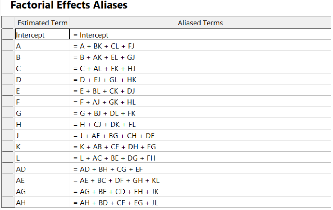
Table 1. Starting alias structure for 11-factor resolution III design
Notice that each main effect is aliased with multiple two-factor interactions.
By augmenting this bad design with a foldover (see Figure 1), you can de-alias the main effects from the two-factor interactions.
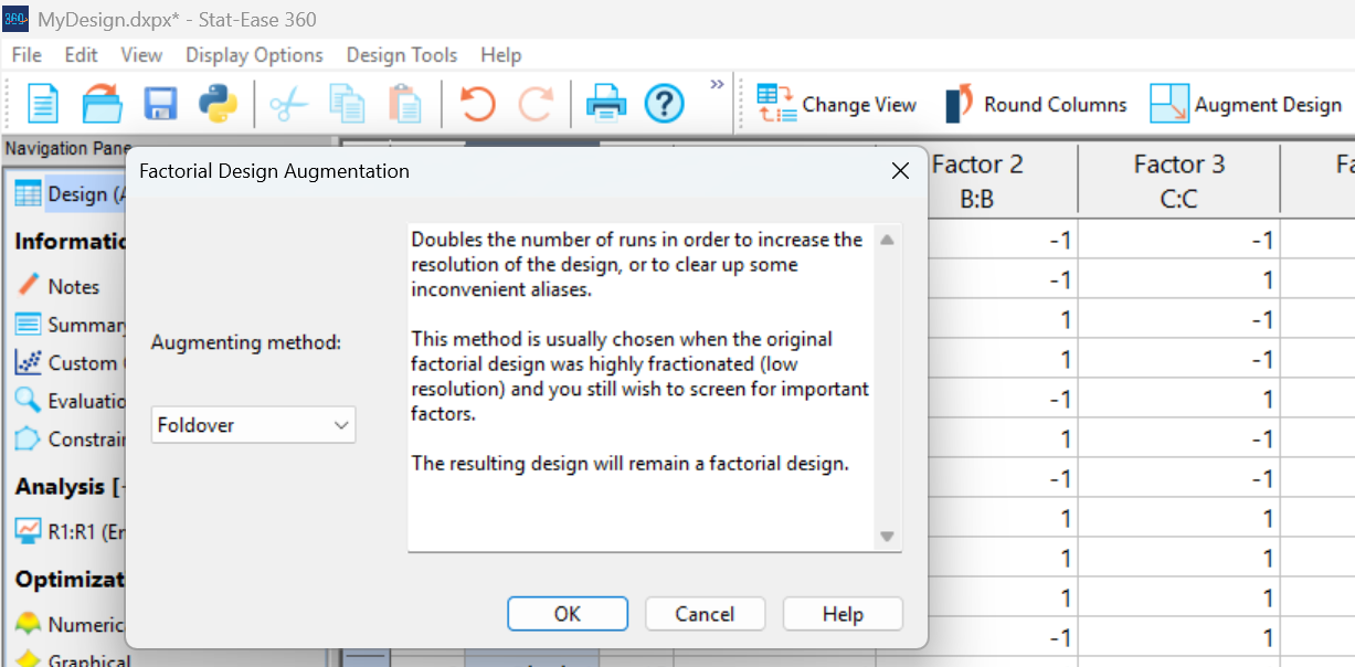
Figure 1: Using Stat-Ease software’s augmentation to do a foldover
The new runs are put in a second block. This structure removes any shift in response that may occur from when you ran the first experiment, such as an increase or decrease due to differing ambient conditions.
Table 2 shows the new, improved, alias structure.
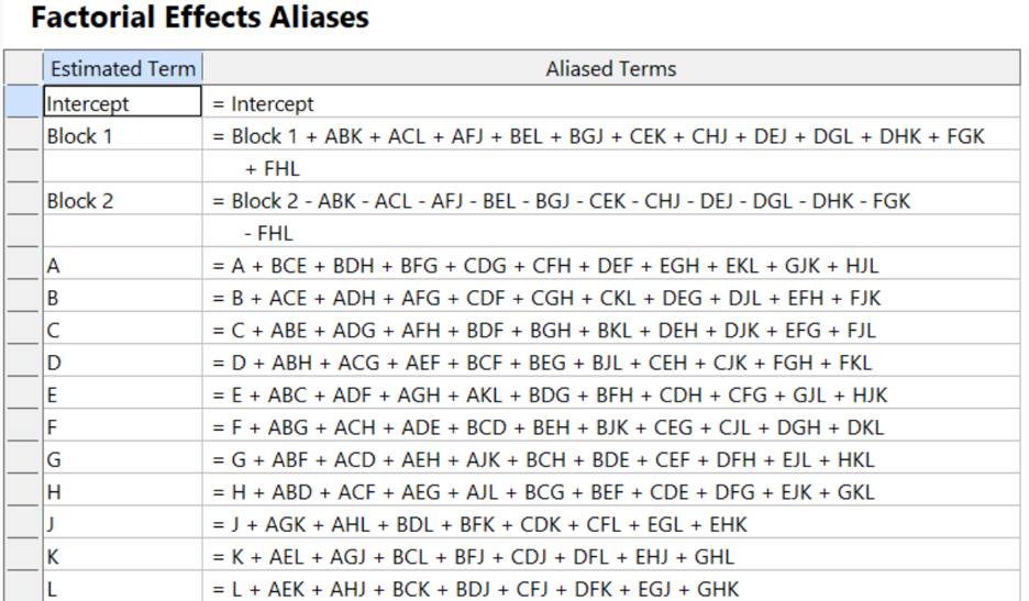
Table 2: Alias structure after the foldover
Note that it took 32 runs to get to the point where it’s confident that the main effects are properly assessed. It would have been far better off to start with a minimum-run screening design for 11 factors, requiring only 24 runs (including 2 runs to bolster it against outliers). However, in our scenario, this would be wishful thinking, since we cannot go back in time. Consider the foldover in this case to be a design repair to achieve the resolution IV needed to safely screen factors down to a vital few for further investigation.
Foldover augmentation also works to de-alias Plackett-Burman designs. Handy!
The Do's and Don'ts for Screening Process Factors
Adapted from Mark Anderson's 2023 webinar, "Do's & Don'ts for Screening Process Factors."
Over the years working with process development engineers on scale-up and manufacturing troubleshooting, we've noticed a pattern: the factors that experts think drive their process are rarely the whole story. There are often other variables at play that nobody anticipates. The best way to uncover these is by using screening designs: broad, shallow experiments that help you uncover previously unknown factors. Done right, a well-designed screening study can transform your understanding of a process and point you directly to the vital few factors worth exploring in depth.
First, let’s make sure we understand what a screening design does in the overall arc of process optimization. Screening designs exist to help ensure we are working with the right factors in subsequent optimization studies. Figure 1 explains the overall strategy. Note that interactions – often the key to process improvement – are not identified until the subsequent step. But a good screening design can shed some light on whether or not there are interactions to further pursue.
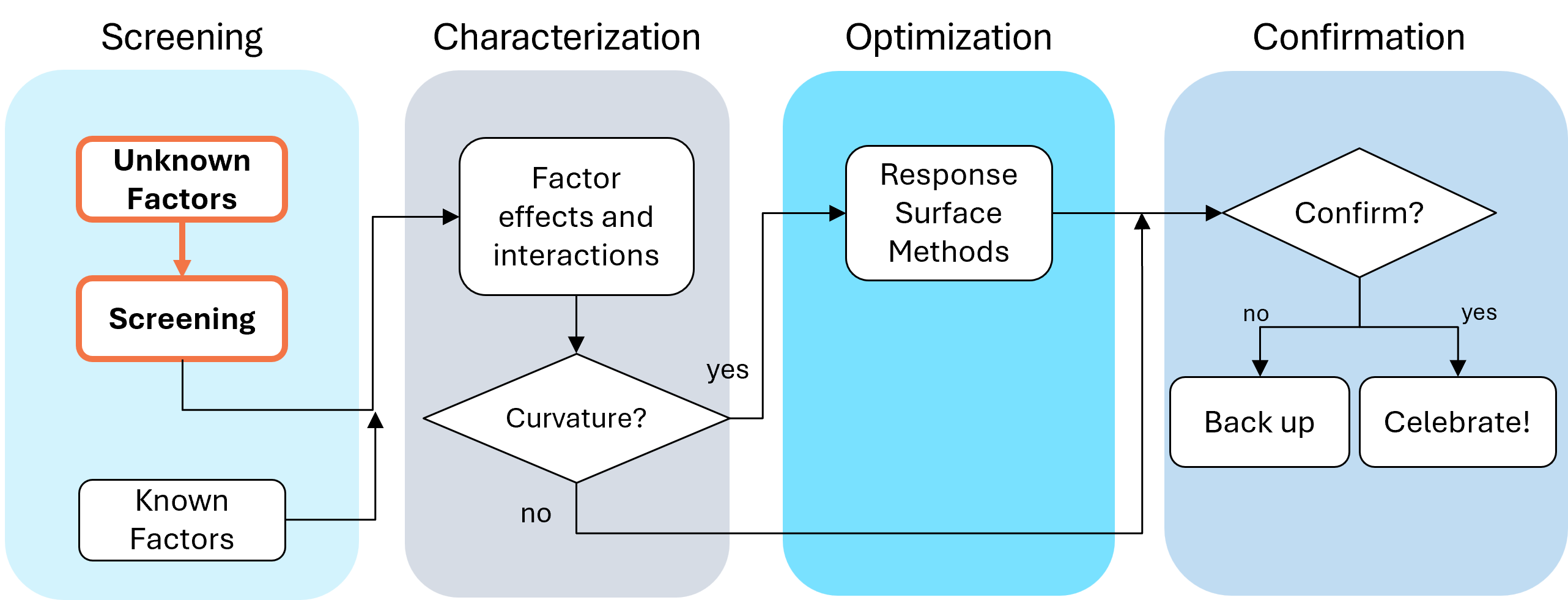
Fig. 1: Where screening fits in the SCOR strategy of experimentation.
With this strategy in view, here are the core do's and don'ts on screening designs. Consider this your field guide for avoiding the most common (and costly) mistakes.
DON'T: Include Factors You Already Know Will Affect the Process
This one surprises a lot of people, and has been the topic of heated discussions within our team. Why would you exclude a known important factor?
The answer is strategic focus and efficiency. By setting known factors aside during screening, you can concentrate on previously unknown factors: ones that might derail your process in unexpected ways. A broad and shallow two-level screening design lets you quickly identify the "vital few" from the "trivial many." In our experience, roughly 20% of factors you didn't expect to matter, matter! The known factors can be merged back in during the next phase of experimentation.
DON'T: Use Low Resolution Designs for Screening
This is our biggest pet peeve. Two types of designs fall into this trap: regular fractional factorials at Resolution III (shown as "red" designs in Stat-Ease software[MA3.1]), which alias main effects directly with two-factor interactions, and Plackett-Burman designs with even worse aliasing. That's a fatal flaw for screening, because if any factors interact (and in real processes, they often do) your main effect estimates are corrupted. You simply cannot trust what the analysis is telling you.
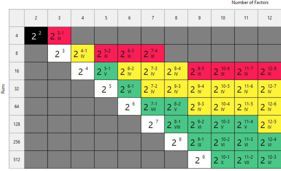
Fig. 2: Stat-Ease software's design picker, color-coded for your convenience.
We're particularly troubled by how often Plackett-Burman designs get recommended for screening. Even the NIST Engineering Statistics Handbook suggests using them, while simultaneously noting that “main effects are in general heavily confounded with two-factor interactions.” To us, that's an oxymoron. If main effects are confounded with two-factor interactions, how exactly is this a screening design? You can’t screen anything out!
To illustrate the danger, we ran a simulation using the classic filtration rate dataset from Doug Montgomery's textbook Design and Analysis of Experiments. The full factorial result was clear: factors A (temperature), C (concentration), and D (stirring rate) were significant, along with strong AC and AD interactions.
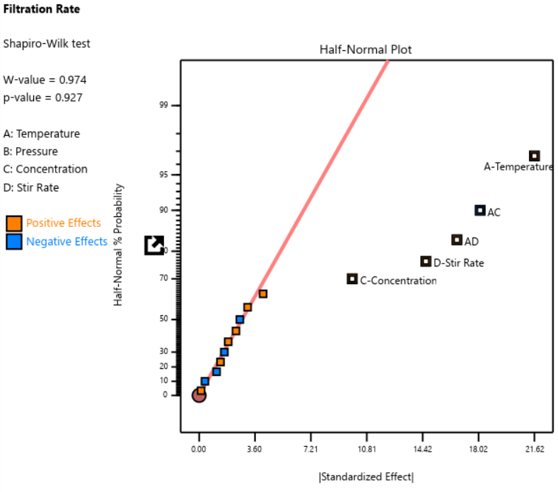
Fig. 3: Half-normal plot of effects for the full factorial design. Note that the selected effects are to well the right of the guideline.
When we re-ran the same underlying model through a 12-run Plackett-Burman simulation, the results were alarming. The AC and AD interactions got “smeared out” across multiple dummy factors. In particular, a fake factor E appeared significant when it was actually picking up aliased pieces of AC and AD. Meanwhile, the real main effect of D was undercut by its aliasing with one-third of AC, causing a cancellation. The result? Only factor A was correctly identified. Factors C and D were missed entirely.
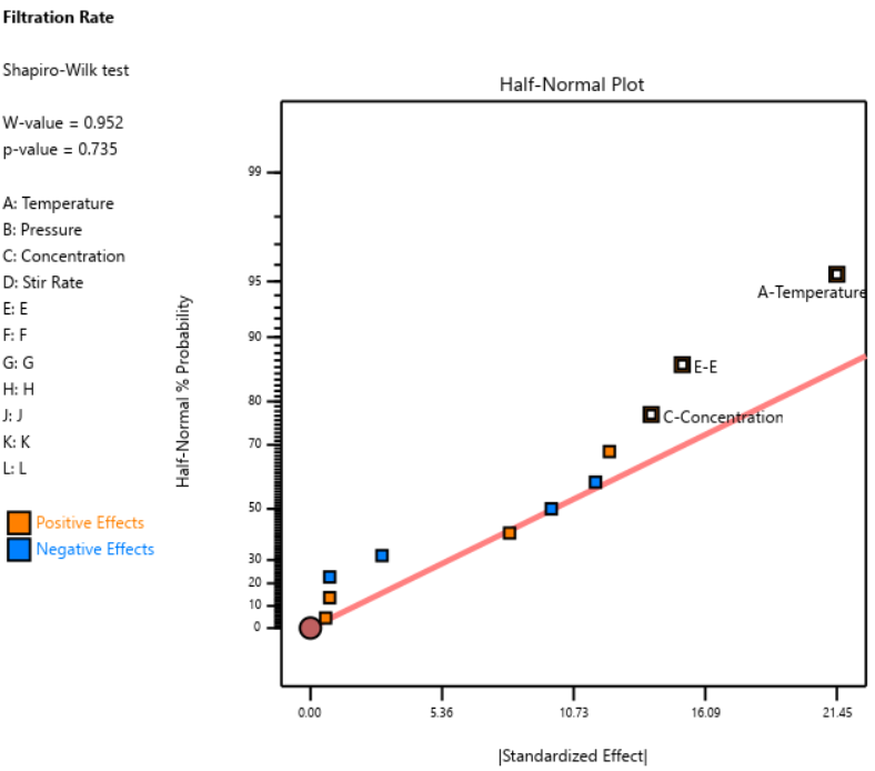
Fig. 4: Half-normal plot of effects for the Plackett-Burman design. None of the effects are to the right of the line, meaning this experiment shows no significant factors or interactions.
DOE pioneer George Box once said that running Resolution III or PB designs are "like kicking the TV to make it work." Sometimes you're desperate enough to try it, but there’s no guarantee you’ll get a usable result.
A Case Study in What NOT to Do
One of our users, a pharmaceutical process developer, sent in his design results hoping we could help salvage them. He had seven factors (time, temperature, and related process variables) and chose a Resolution III design with seven factors in eight runs. This is known as a ‘saturated’ design—the most factors that can be crammed into a given number of runs in a regular fractional factorial. Then, apparently recognizing the power would be low, he replicated the design, giving him 16 runs total, still at Resolution III.
As Ronald Fisher put it, a statistician is more like a pathologist than a medical doctor. We can tell you what killed the patient, but we can't bring it back to life. We wish this researcher had contacted us before running the design. The 16-run Resolution IV option for seven factors was right there in the software, highlighted in yellow (indicating a design more suitable for screening) It would have given him both the power and the resolution he needed. Instead, he replicated a bad design, which is a bit like making a photocopy of a photocopy.
The power calculations for these two designs are the clincher. One replicate of eight runs gave only 50% power to detect his specified signal-to-noise ratio of 1.67. Two replicates (still Resolution III) pushed that to about 87%: good power, terrible resolution. The unreplicated Resolution IV design in 16 runs also reached about 83% power, while giving him a design that could actually distinguish main effects from interactions.
DO: Start with a Resolution IV Design
As stated above, Resolution IV is the “Goldilocks” choice for screening. Main effects are aliased only with three-factor interactions, which are rarely active. That means that any significant main effects detected are almost certainly real. While two-factor interactions in a Res IV design may be murky, you'll know to investigate these further.
In Stat-Ease software, these are the yellow designs in the Regular Two-Level design builder. For up to eight factors, these medium resolution designs work beautifully. For nine or more factors, Stat-Ease’s proprietary, optimally templated, Minimum-Run screening design provides an excellent option when the standard design alternatives get too big.
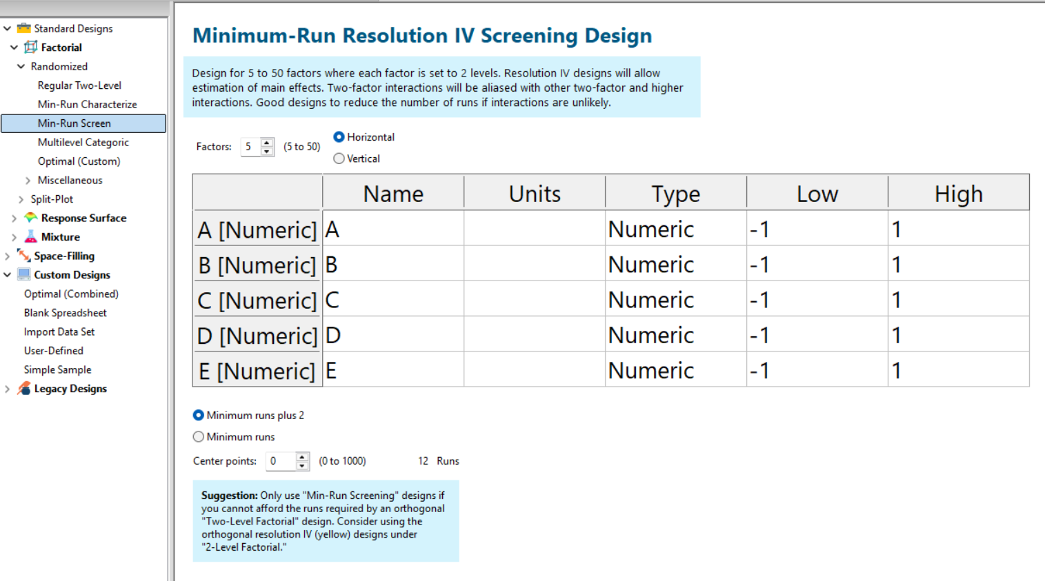
Fig. 5: Min-Run Screening designs in Stat-Ease software. Choose them from the sidebar on the left.
Summary: The Screening Do's and Don'ts
To recap: hold known factors aside during screening and focus on the unknowns. Known factors will be studied together with the survivors of the screening design in the next round of experimentation when characterizing two-factor interactions with high-resolution designs. Avoid low-resolution designs: the red standard ones or Plackett-Burmans. Instead, go with medium Resolution IV or minimum run screening design from the start.
All Stat-Ease software licensees have access to our DOE experts. We encourage you to contact us before making a big mistake in your design of experiments. Don’t hesitate to reach out: do your screening right the first time.
Like the blog? Never miss a post - sign up for our blog post mailing list.
10 highly intelligent features that make the most from every experiment
Stat-Ease software provides powerful tools for design of experiments (DOE) with a great deal of intelligence baked in. Here are 10 “smart” features that make DOE easy for our users. From bottom to top (ordered by DOE phase: design, modeling, optimization, and confirmation), every one of them provides great value.
Here we go—the countdown begins!
- Factorial design-building wizard guides you to right-sized experiments via a ‘heads-up’ on power to detect important effects despite the variability of run, sample, and test.
- Optimal design builder’s exchange algorithm delivers a finely crafted experiment customized per your specifications.
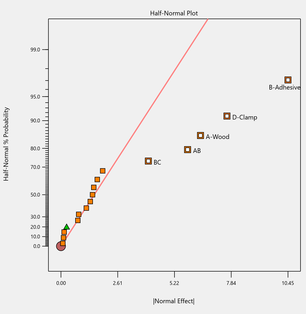
- Preset lineup of near-zero effects on the half-normal graph of factorial effects makes it easy to see those that merit selection.
- Scoring system for polynomial models suggests just the right 'Goldilocks' level that does not underfit or overfit your results.
- Box-Cox plot studies your model residuals and recommends whether or not to apply a transformation for a better fit and advises which one will do best.
- Detection of non-hierarchical models and, if you agree to fix this, the needed terms get added back for a well-formulated polynomial.
- Application of a curvature test to two-level factorial designs with center points with advice on how to augment the design if significant.
- Annotations on statistical outputs that explain them in plain English and provide advice on what to do when they go awry.
- Numerical search using a highly effective variable-size simplex algorithm finds the most desirable combination of factor settings and/or component levels meeting all your goals for process efficiency, product efficacy, and cost reduction.
- Confirmation tool smartly updates the prediction interval based on the number of follow-up runs at your chosen setting.
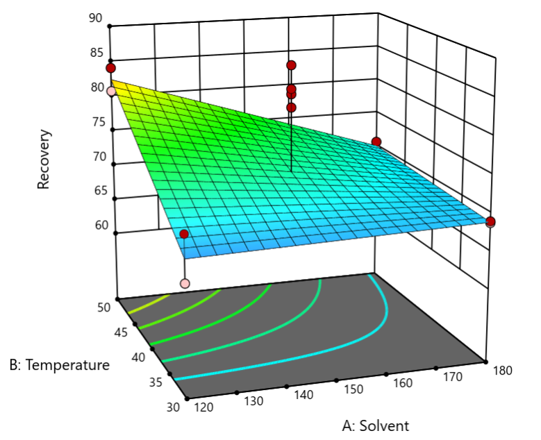
Finally, one bonus feature in Stat-Ease software that will make you more intelligent: screen tips via the lightbulb icon (click the >> chevron if showing) next to the Help bubble. This will show interesting information about each feature on the screen for you to understand the underlying statistics.
Email me your favorite “they thought of everything” quality aspect of Stat-Ease software, and I will add it to my list for my next ‘shout out’ on intelligent features.
Mixture Designs – Gimmick or Magic?
Years ago, I attended Stat-Ease’s Modern DOE workshop in Minneapolis—a five day deep dive into factorial and response surface methods (RSM). I then completed a four day course on Mixture Design for Optimal Formulations. Since then, I’ve trained practitioners and coached users through hundreds of experiments. One pattern is consistent: most people—myself included—gravitate toward familiar factorial or RSM designs and hesitate to use mixture designs for formulation work.
The result is force-fitting RSM tools onto mixture problems. Like using a flathead screwdriver on a Phillips screw, it can work, but it’s rarely ideal. And, avoiding mixture designs can actually create real problems. So, what makes mixtures unique, and what goes wrong when we ignore that?
Why Mixtures Are Different
In mixtures, ratios drive responses, not absolute amounts. The flavor of a cookie depends on the ratio of flour, sugar, fat, and salt; not the grams of sugar alone. And because mixture components must sum to a total (often 100%), choosing levels for some ingredients automatically constrains the rest.
The Ratio Workaround—and Its Limits
A common workaround is to convert a q-component mixture into q-1 ratios and run a standard RSM design¹. For example, suppose we’re formulating a sweetener blend (A = sugar, B = corn syrup, C = honey) that always makes up 10% of a cookie recipe. If we express the system using ratios B:A and C:A, we can build a two factor RSM design with ratio levels like 1:1, 2:1, and 3:1.
But compared to a true three component mixture design, the difference is clear. The ratio based design samples only narrow rays of the mixture space, leaving large regions unexplored. Standard error plots show that a proper mixture design provides far better prediction capability across the full region.
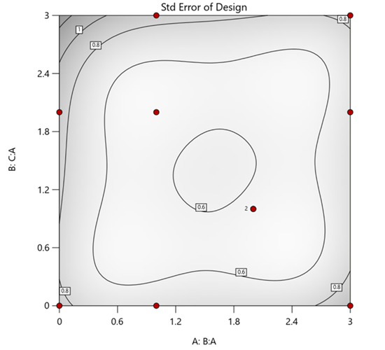
Figure 1. Optimal 10-run RSM design layout using two ratios for a three-component mixture. The shading conveys the relative standard error: lighter is lower, darker is higher.
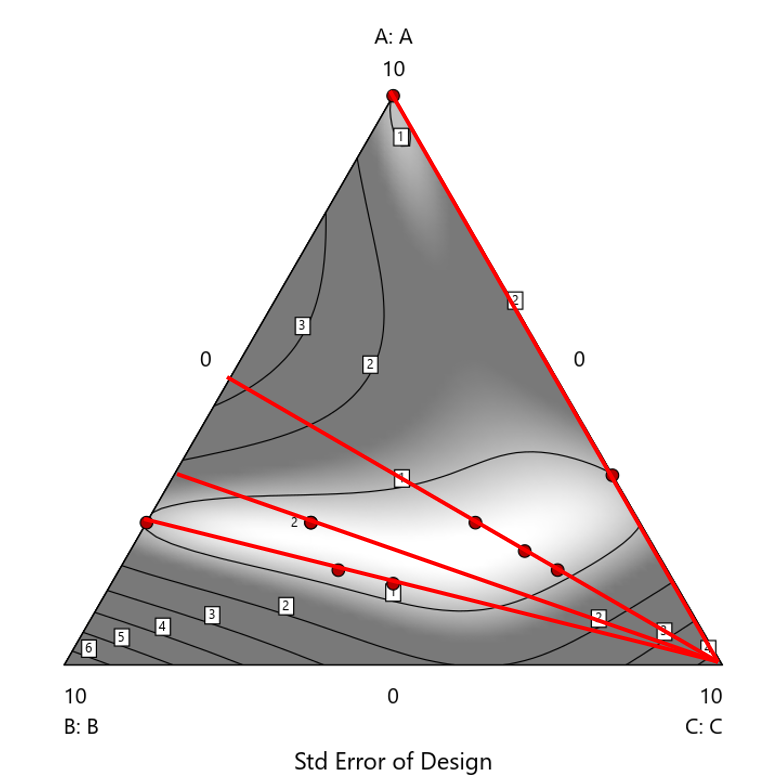
Figure 2. Translation of the ratio design from Figure 1 onto a three-component layout.
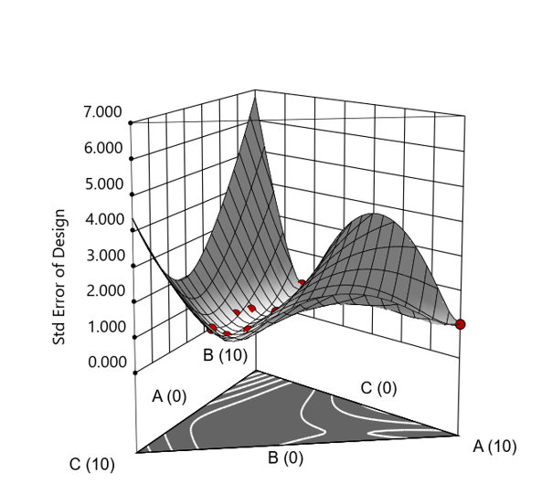
Figure 3. Standard error 3D plot of the 10-run ratio design.
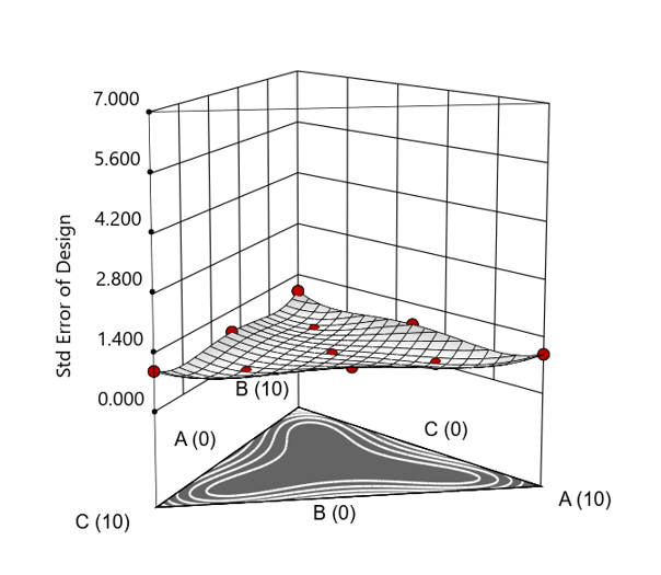
Figure 4. Standard error 3D plot for a 10-run augmented simplex mixture design.
In short: the ratio trick can work, but it never matches the statistical properties of a proper mixture design.
The Slack Component Argument
Another justification for using RSM is when one ingredient is believed to be inconsequential. Perhaps the component is believed to be inert or is simply a diluent that makes up the balance of a formulation. The idea is to treat this component as a slack variable and allow it to fill whatever space remains after setting the other ingredients. One slack approach is to simply use the upper and lower values as levels of the non slack components in a standard RSM. Below is a comparison of a three-component system analyzed as a true mixture design alongside a two-factor RSM that eliminates the diluent as a component.
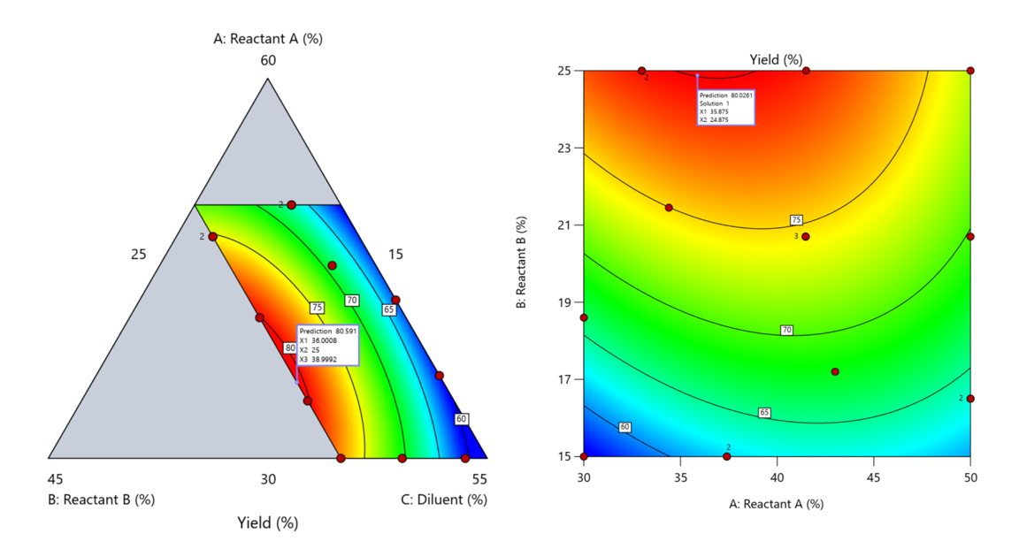
Figure 5. Optimization comparison of a three component mixture design and a two factor (component) RSM approach
In this case, both approaches found essentially the same optimal conditions. Ignoring the diluent really didn’t impact the story, but the RSM approach is not specifically assessing the interactive behavior between the reactants and the diluent. If we study the system as an RSM, we assume the interactions involving the omitted component were not consequential—which may not be true. Cornell² states that the factor effects we are seeing are actually the effects confounded with the opposite effect of the ignored component. Without using a mixture design, we would have no way of validating our assumptions about these interactions.
Cornell³ also describes an alternative slack approach where the slack component is included in the design but excluded from the predictive model. Some practitioners believe this approach makes sense when the diluent interacts weakly with the key ingredients, the omitted component is the one with the widest range of proportionate values, or if that component makes up the bulk of the formulation. But statistically, this presents some interesting complexities.
Using the above chemical reaction example, Figure 6 shows the model differences between the Scheffé approach and the resulting models when each component is considered the slack component.
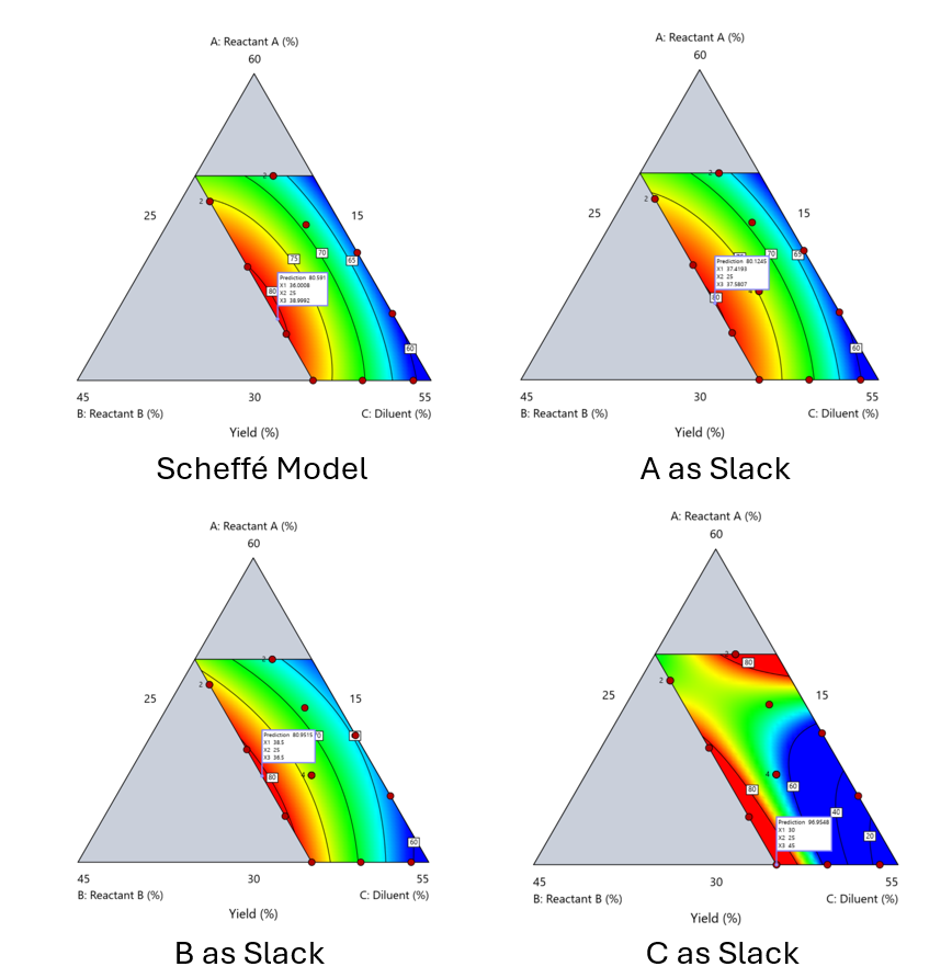
Figure 6. Comparing the Scheffé and Slack modeling techniques.
Note that in this example, while some of the models are similar, the one involving the diluent as the slack variable differs most from the Scheffé standard. Had we assumed the diluent could have been used as the slack variable, we would have poorly modeled and optimized the system.
Because slack variable models exclude at least one component and its interactions, they’re best avoided when possible.
When Components Don’t Share a Scale
Mixture designs require all components to share a common basis (percent, ppm, etc.). This becomes awkward when ingredients span vastly different scales—for example, large amounts of reactants plus a catalyst at ppm levels. The phenomenon is often called the “sliver effect” because the design space becomes a very narrow region for the low-level component, as shown in Figure 7.
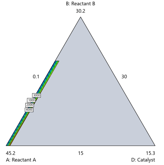
Figure 7. The sliver effect that can occur when one component is present in much lower levels than the balance of the formulation.
One way to avoid a sliver is to change the metric: in this case, changing to molar percent may put the components on a comparable basis and all components could have been included in the mixture design. Or, if I’m still avoiding mixtures, a practical solution is a combined design: treat the main ingredients as a mixture and the catalyst as a process variable. Both the mixture and the catalyst should be modeled quadratically to capture interactions. However, the interactive nature of components is best resolved when all ingredients are included in the mixture design.
The Bottom Line
For formulations, and recipes, the best results come from designs built specifically for mixtures. They’re not gimmicks or magic; they’re the right tools for the job. Stat-Ease provides tutorials and webinars to help you get started:
- A Crash Course in Mixture Design of Experiments
- Optimal experiment designs that combine mixture, process and categorical inputs
Or, if you’d prefer a hands-on, instructor-led experience (maybe with me!), sign up for one of the following courses:
References:
- Response Surface Methodology, 4th edition, Myers, Montgomery, Anderson-Cook, pp. 759-763 (Wiley).
- Experiments with Mixtures, 3rd edition, John Cornell, p. 16 (Wiley).
- Experiments with Mixtures, 3rd edition, John Cornell, p. 333-343 (Wiley).
Like the blog? Never miss a post - sign up for our blog post mailing list.