Stat-Ease Blog

Categories
Hear Ye, Hear Ye: A Response Surface Method (RSM) Experiment on Sound Produces Surprising Results
A few years ago, while evaluating our training facility in Minneapolis, I came up with a fun experiment that demonstrates a great application of RSM for process optimization. It involves how sound travels to our students as a function of where they sit. The inspiration for this experiment came from a presentation by Tom Burns of Starkey Labs to our 5th European DOE User Meeting. As I reported in our September 2014 Stat-Teaser, Tom put RSM to good use for optimizing hearing aids.
Background
Classroom acoustics affect speech intelligibility and thus the quality of education. The sound intensity from a point source decays rapidly by distance according to the inverse square law. However, reflections and reverberations create variations by location for each student—some good (e.g., the Whispering Gallery at Chicago Museum of Science and Industry—a very delightful place to visit, preferably with young people in tow), but for others bad (e.g., echoing). Furthermore, it can be expected to change quite a bit from being empty versus fully occupied. (Our then-IT guy Mike, who moonlights as a sound-system tech, called these—the audience, that is—“meat baffles”.)
Sound is measured on a logarithmic scale called “decibels” (dB). The dBA adjusts for varying sensitivities of the human ear.
Frequency is another aspect of sound that must be taken into account for acoustics. According to Wikipedia, the typical adult male speaks at a fundamental frequency from 85 to 180 Hz. The range for a typical adult female is from 165 to 255 Hz.
Procedure

Stat-Ease training room at one of our old headquarters—sound test points spotted by yellow cups.
This experiment sampled sound on a 3x3 grid from left to right (L-R, coded -1 to +1) and front to back (F-B, -1 to +1)—see a picture of the training room above for location—according to a randomized RSM test plan. A quadratic model was fitted to the data, with its predictions then mapped to provide a picture of how sound travels in the classroom. The goal was to provide acoustics that deliver just enough loudness to those at the back without blasting the students sitting up front.
Using sticky notes as markers (labeled by coordinates), I laid out the grid in the Stat-Ease training room across the first 3 double-wide-table rows (4th row excluded) in two blocks:
- 2² factorial (square perimeter points) with 2 center points (CPs).
- Remainder of the 32 design (mid-points of edges) with 2 additional CPs.
I generated sound from the Online Tone Generator at 170 hertz—a frequency chosen to simulate voice at the overlap of male (lower) vs female ranges. Other settings were left at their defaults: mid-volume, sine wave. The sound was amplified by twin Dell 6-watt Harman-Kardon multimedia speakers, circa 1990s. They do not build them like this anymore 😉 These speakers reside on a counter up front—spaced about a foot apart. I measured sound intensity on the dBA scale with a GoerTek Digital Mini Sound Pressure Level Meter (~$18 via Amazon).
Results
I generated my experiment via the Response Surface tab in Design-Expert® software (this 3³ design shows up under "Miscellaneous" as Type "3-level factorial"). Via various manipulations of the layout (not too difficult), I divided the runs into the two blocks, within which I re-randomized the order. See the results tabulated below.
| Block | Run | Space Type | Coordinate (A: L-R) | Coordinate (B: F-B) | Sound (dBA) |
|---|---|---|---|---|---|
| 1 | 1 | Factorial | -1 | 1 | 70 |
| 1 | 2 | Center | 0 | 0 | 58 |
| 1 | 3 | Factorial | 1 | -1 | 73.3 |
| 1 | 4 | Factorial | 1 | 1 | 62 |
| 1 | 5 | Center | 0 | 0 | 58.3 |
| 1 | 6 | Factorial | -1 | -1 | 71.4 |
| 1 | 7 | Center | 0 | 0 | 58 |
| 2 | 8 | CentEdge | -1 | 0 | 64.5 |
| 2 | 9 | Center | 0 | 0 | 58.2 |
| 2 | 10 | CentEdge | 0 | 1 | 61.8 |
| 2 | 11 | CentEdge | 0 | -1 | 69.6 |
| 2 | 12 | Center | 0 | 0 | 57.5 |
| 2 | 13 | CentEdge | 1 | 0 | 60.5 |
Notice that the readings at the center are consistently lower than around the edge of the three-table space. So, not surprisingly, the factorial model based on block 1 exhibits significant curvature (p<0.0001). That leads to making use of the second block of runs to fill out the RSM design in order to fit the quadratic model. I was hoping things would play out like this to provide a teaching point in our DOESH class—the value of an iterative strategy of experimentation.
The 3D surface graph shown below illustrates the unexpected dampening (cancelling?) of sound at the middle of our Stat-Ease training room.
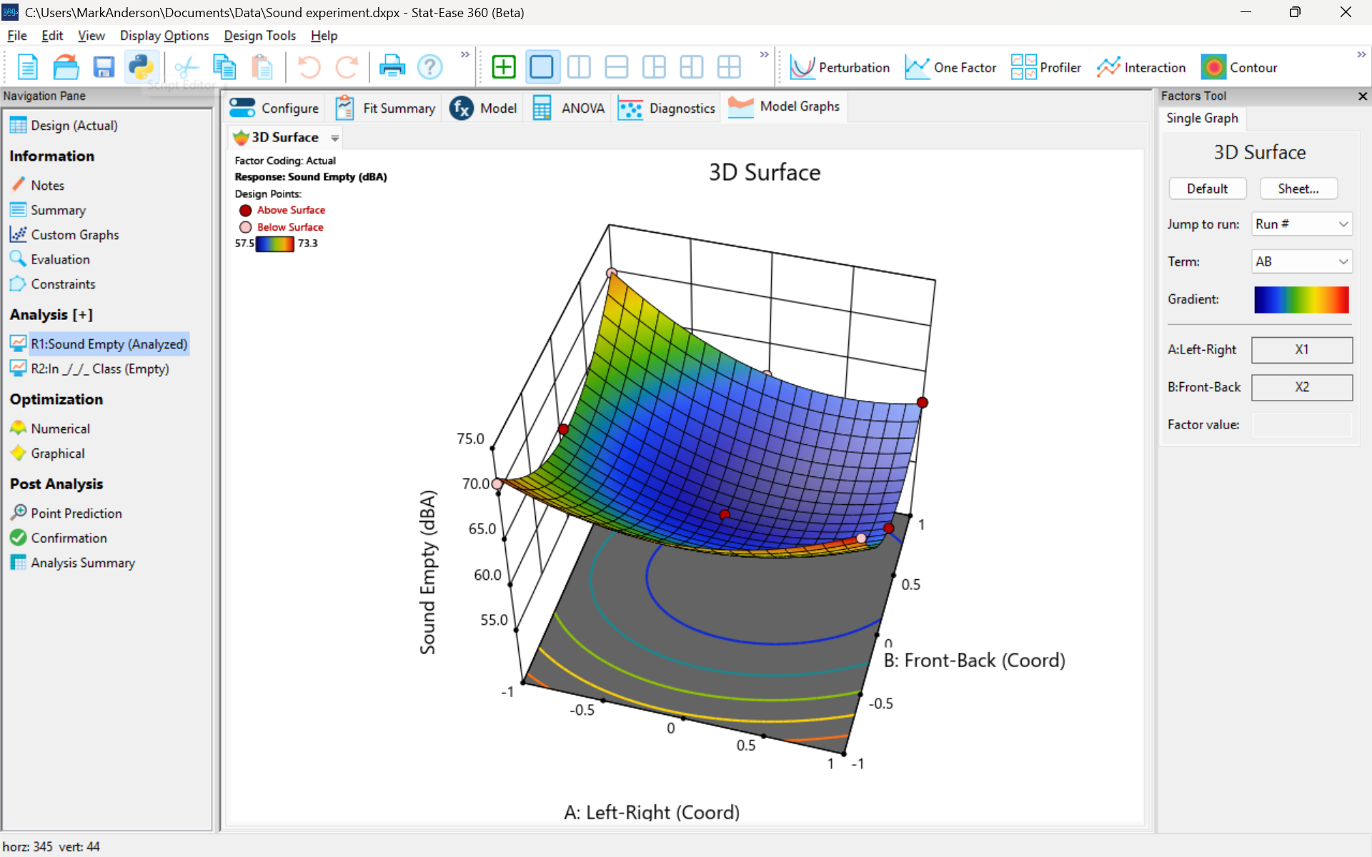
3D surface graph of sound by classroom coordinate.
Perhaps this sound ‘map’ is typical of most classrooms. I suppose that it could be counteracted by putting acoustic reflectors overhead. However, the minimum loudness of 57.4 (found via numeric optimization and flagged over the surface pictured) is very audible by my reckoning (having sat in that position when measuring the dBA). It falls within the green zone for OSHA’s decibel scale, as does the maximum of 73.6 dBA, so all is good.
What next
The results documented here came from an empty classroom. I would like to do it again with students (aka meat baffles) present. I wonder how that will affect the sound map. Of course, many other factors could be tested. For example, Rachel from our Front Office team suggested I try elevating the speakers. Another issue is the frequency of sound emitted. Furthermore, the oscillation can be varied—sine, square, triangle and sawtooth waves could be tried. Other types of speakers would surely make a big difference.
What else can you think of to experiment on for sound measurement? Let me know.
Like the blog? Never miss a post - sign up for our blog post mailing list.
Are optimal response surface method (RSM) designs always the optimal choice?
Most people who have been exposed to design of experiment (DOE) concepts have probably heard of factorial designs—designs that target the discovery of factor and interaction effects on their process. But factorial designs are hardly the only tool in the shed. And oftentimes to properly optimize our system a more advanced response surface design (RSM) will prove to be beneficial, or even essential.
This is the case when there is “curvature” within the design space, suggesting that quadratic (or higher) order terms are needed to make valid predictions between the extreme high/low process factor settings. This gives us the opportunity to find optimal solutions that reside in the interior of the design space. If you include center points in a factorial design, you can check for non-linear behavior within the design space to see if an RSM design would be useful (1). But which RSM options should you pick?
Let’s start by introducing the Stat-Ease® software menu options for RSM designs. Once we understand the alternatives we can better understand when which might be most useful for any given situation and why optimal designs are great—when needed.
- First on the list is the central composite design (our software default)
- Next is the Box-Behnken design
- And third is something called optimal design
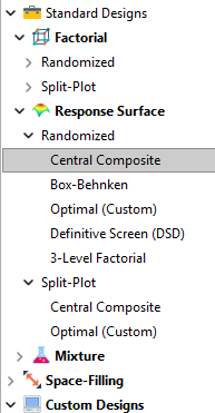
Stat-Ease software design selection options
The natural question that often pops up is this. Since optimal designs are third on our list, are we defaulting to suboptimal designs? Let’s dig in a bit deeper.
The central composite design (“CCD”) has traditionally been the workhorse of response surface methods. It has a predictable structure (5 levels for each factor). It is robust to some variations in the actual factor settings, meaning that you will still get decent quadratic model fits even if the axial runs have to be tweaked to achieve some practical values, including the extreme case when the axial points are placed at the face of the factorial “cube” making the design a 3-level study. A CCD is the design of choice when it fits the problem and generally creates predictive models that are effective throughout the design space--the factorial region of the design. Note that the quadratic predictive models generally improve when the axial points reside outside the face of the factorial cube.
When a 5-level study is not practical, for example, if we are looking at catalyst levels and the lower axial point would be zero or a negative number, we may be forced to bring the axial points to the face of the factorial cube. When this happens, Box-Behnken designs would be another standard design to consider. It is a 3-level design that is laid out slightly differently than a CCD. In general, the Box-Behnken results in a design with marginally fewer runs and is generally capable of creating very useful quadratic predictive models.
These standard designs are very effective when our experiments can be performed precisely as scripted by the design template. But this is not always the case, and when it is not we will need to apply a more novel approach to create a customized DOE.
Optimal designs are “custom” creations that come in a variety of alphabet-soup flavors—I, D, A, G, etc. The idea with optimal designs is that given your design needs and run-budget, the optimization algorithm will seek out the best choice of runs to provide you with a useful predictive model that is as effective as possible. Use of the system defaults when creating optimal designs is highly advised. Custom optimal designs often have fewer runs than the central composite option. Because they are generated by a computer algorithm, the number of levels per factor and the positioning of the points in the design space may be unique each time the design is built. This may make newcomers to optimal designs a bit uneasy. But, optimal designs fill the gap when:
- The design space is not “cuboidal”— there are constraints on the operating region that make the design space lopsided or truncated.
- There are categoric or discrete numeric factors to deal with.
- The expected polynomial model is something other than a full quadratic.
- You are trying to augment an existing design to expand the design space or to upgrade to a higher order model.
The classic designs provide simple and robust solutions and should always be considered first when planning an experiment. However, when these designs don’t work well because of budget or practical design space constraints, don’t be afraid to go “outside the box” and explore your other options. The goal is to choose a design that fits the problem!
Acknowledgement: This post is an update of an article by Shari Kraber on “Modern Alternatives to Traditional Designs Modern Alternatives to Traditional Designs" published in the April 2011 STATeaser.
(1) See Shari Kraber’s blog post, “"Energize Two-Level Factorials - Add Center Points!” from August. 23, 2018 for additional insights.
Like the blog? Never miss a post - sign up for our blog post mailing list.
Publication Roundup January 2025
Welcome to our first Publication Roundup! In these monthly posts, we'll feature recent papers that cited Design-Expert® or Stat-Ease® 360 software. Please submit your paper to us if you haven't seen it featured yet!
Mark's comment: make sure to check out publication #4 by researchers from GITAM School of Science in Hyderabad, India. They provide all the raw data, the ANOVAs, model graphs and, most importantly, enhancing the quality of medicines via multifactor design of experiments (DOE).
- Innovative study on chalcopyrite flotation efficiency with xanthate and ester collectors blend using response surface methodology (B.B.D): towards sustainability
Scientific Reports volume 15, Article number: 65 (2025)
Authors: Imkong Rathi & Shravan Kumar - Fabrication and In Vivo Evaluation of In Situ pH-Sensitive Hydrogel of Sonidegib–Invasomes via Intratumoral Delivery for Basal Cell Skin Cancer Management
Pharmaceuticals 2025, 18(1), 31
Authors: Maha M. Ghalwash, Amr Gamal Fouad, Nada H. Mohammed, Marwa M. Nagib, Sherif Faysal Abdelfattah Khalil, Amany Belal, Samar F. Miski, Nisreen Khalid Aref Albezrah, Amani Elsayed, Ahmed H. E. Hassan, Eun Joo Roh, & Shaimaa El-Housiny - Formulation development and evaluation, in silico PBPK modeling and in vivo pharmacodynamic studies of clozapine matrix type transdermal patches
Scientific Reports volume 15, Article number: 1204 (2025)
Authors: Abdul Qadir, Syed Umer Jan, Muhammad Harris Shoaib, Muhammad Sikandar, Rabia Ismail Yousuf, Fatima Ramzan Ali, Fahad Siddiqui, Abdul Jabbar Magsi, Ghulam Mustafa, Muhammad Talha Saleem, Shafi Mohammad, Mohammad Younis & Muhammad Arsalan - Unique Research for Developing a Full Factorial Design Evaluated Liquid Chromatography Technique for Estimating Budesonide and Formoterol Fumarate Dihydrate in the Presence of Specified and Degradation Impurities in Dry Powder Inhalation
Biomedical Chromatography: Volume 39, Issue 2, February 2025
Authors: Lova Gani Raju Bandaru, Naresh Konduru, Leela Prasad Kowtharapu, Rambabu Gundla, Phani Raja Kanuparthy, Naresh Kumar Katari - Synergistic effects of fly ash and graphene oxide composites at high temperatures and prediction using ANN and RSM approach
Scientific Reports volume 15, Article number: 1604 (2025)
Authors: I. Ramana & N. Parthasarathi - Enhancement Strategy for Protocatechuic Acid Production Using Corynebacterium glutamicum with Focus on Continuous Fermentation Scale-Up and Cytotoxicity Management
International Journal of Molecular Sciences 2025, 26(1), 396
Authors: Jiwoon Chung, Wooshik Shin, Chulhwan Park, and Jaehoon Cho - An exploration of RSM, ANN, and ANFIS models for methylene blue dye adsorption using Oryza sativa straw biomass: a comparative approach
Scientific Reports volume 15, Article number: 2979 (2025)
Authors: Sheetal Kumari, Smriti Agarwal, Manish Kumar, Pinki Sharma, Ajay Kumar, Abeer Hashem, Nouf H. Alotaibi, Elsayed Fathi Abd-Allah & Manoj Chandra Garg - Manipulated Slow Release of Florfenicol Hydrogels for Effective Treatment of Anti-Intestinal Bacterial Infections
International Journal of Nanomedicine, Volume 2025:20, Pages 541—555, 13 January 2025.
Authors: Luo W, Zhang M, Jiang Y, Ma G, Liu J, Dawood AS, Xie S, Algharib SA - Preparation of slow-release fertilizer derived from rice husk silica, hydroxypropyl methylcellulose, polyvinyl alcohol and paper composite coated urea
Heliyon, Volume 11, Issue 2, 30 January 2025
Authors: Idayatu Dere, Daniel T. Gungula, Semiu A. Kareem, Fartisincha Peingurta Andrew, Abdullahi M. Saddiq, Vadlya T. Tame, Haruna M. Kefas, David O. Patrick, Japari I. Joseph - Elimination of Ni(II) from wastewater using metal-organic frameworks and activated algae encapsulated in chitosan/carboxymethyl cellulose hydrogel beads: Adsorption isotherm, kinetic, and optimizing via Box-Behnken design optimization
International Journal of Biological Macromolecules, 21 January 2025, In Press, Journal Pre-proof
Authors: Gamil A.A.M. Al-Hazmi, Nadia H. Elsayed, Jawza Sh. Alnawmasi, Khadra B. Alomari, Ali Hamzah Alessa, Shareefa Ahmed Alshareef, A.A. El-Bindary - QbD-Driven preparation, characterization, and pharmacokinetic investigation of daidzein-l oaded nano-cargos of hydroxyapatite
Scientific Reports volume 15, Article number: 2967 (2025)
Authors: Namrata Gautam, Debopriya Dutta, Saurabh Mittal, Perwez Alam, Nasr A. Emad, Mohamed H. Al-Sabri, Suraj Pal Verma & Sushama Talegaonkar - Lubricity potentials of Azadirachta indica (neem) oil and Cyperus esculentus (tiger nut) oil extracts and their blends in machining of mild steel material
Heliyon, Volume 11, Issue 2, 30 January 2025
Authors: Ignatius Echezona Ekengwu, Ikechukwu Geoffrey Okoli, Obiora Clement Okafor, Obiora Nnaemeka Ezenwa, Joseph Chikodili Ogu - Process Evaluation and Analysis of Variance of Rice Husk Gasification Using Aspen Plus and Design Expert Software
Chemistry Africa (2025)
Authors: Ernest Mbamalu Ezeh, Isah Yakub Mohammed, Epere Aworabhi, Yousif Abdalla
The Importance of Center Points in Central Composite Designs
A central composite design (CCD) is a type of response surface design that will give you very good predictions in the middle of the design space. Many people ask how many center points (CPs) they need to put into a CCD. The number of CPs chosen (typically 5 or 6) influences how the design functions.
Two things need to be considered when choosing the number of CPs in a central composite design:
1) Replicated center points are used to estimate pure error for the lack of fit test. Lack of fit indicates how well the model you have chosen fits the data. With fewer than five or six replicates, the lack of fit test has very low power. You can compare the critical F-values (with a 5% risk level) for a three-factor CCD with 6 center points, versus a design with 3 center points. The 6 center point design will require a critical F-value for lack of fit of 5.05, while the 3 center point design uses a critical F-value of 19.30. This means that the design with only 3 center points is less likely to show a significant lack of fit, even if it is there, making the test almost meaningless.
TIP: True “replicates” are runs that are performed at random intervals during the experiment. It is very important that they capture the true normal process variation! Do not run all the center points grouped together as then most likely their variation will underestimate the real process variation.
2) The default number of center points provides near uniform precision designs. This means that the prediction error inside a sphere that has a radius equal to the ±1 levels is nearly uniform. Thus, your predictions in this region (±1) are equally good. Too few center points inflate the error in the region you are most interested in. This effect (a “bump” in the middle of the graph) can be seen by viewing the standard error plot, as shown in Figures 1 & 2 below. (To see this graph, click on Design Evaluation, Graph and then View, 3D Surface after setting up a design.)
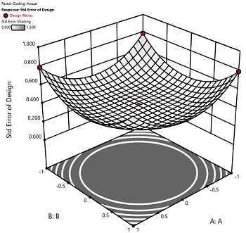
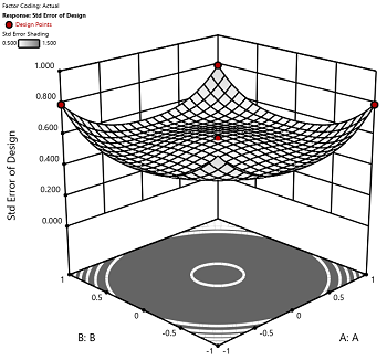
Figure 1 (left): CCD with the 6 center points (5-6 recommended). Figure 2 (right): CCD with only 3 center points. Notice the jump in standard error at the center of figure 2.
Ask yourself this—where do you want the best predictions? Most likely at the middle of the design space. Reducing the number of center points away from the default will substantially damage the prediction capability here! Although it can seem tedious to run all of these replicates, the number of center points does ensure that the analysis of the design can be done well, and that the design is statistically sound.
Augmenting One-Factor-at-a-Time Data to Build a DOE
I am often asked if the results from one-factor-at-a-time (OFAT) studies can be used as a basis for a designed experiment. They can! This augmentation starts by picturing how the current data is laid out, and then adding runs to fill out either a factorial or response surface design space.
One way of testing multiple factors is to choose a starting point and then change the factor level in the direction of interest (Figure 1 – green dots). This is often done one variable at a time “to keep things simple”. This data can confirm an improvement in the response when any of the factors are changed individually. However, it does not tell you if making changes to multiple factors at the same time will improve the response due to synergistic interactions. With today’s complex processes, the one-factor-at-a-time experiment is likely to provide insufficient information.
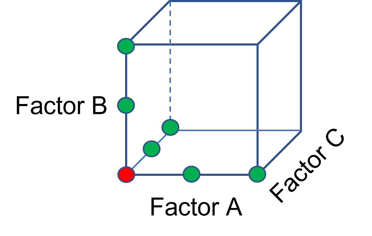
Figure 1: OFAT
The experimenter can augment the existing data by extending a factorial box/cube from the OFAT runs and completing the design by running the corner combinations of the factor levels (Figure 2 – blue dots). When analyzing this data together, the interactions become clear, and the design space is more fully explored.
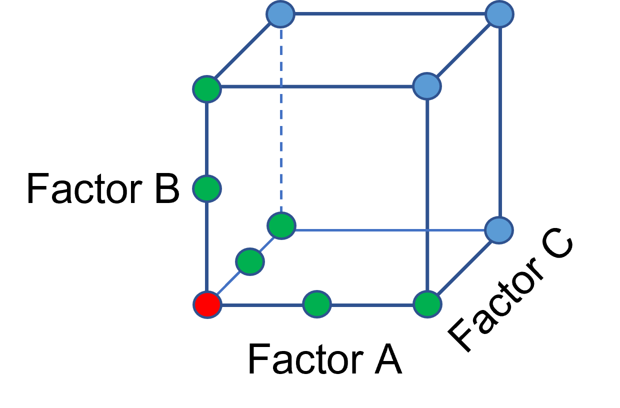
Figure 2: Fill out to factorial region
In other cases, OFAT studies may be done by taking a standard process condition as a starting point and then testing factors at new levels both lower and higher than the standard condition (see Figure 3). This data can estimate linear and nonlinear effects of changing each factor individually. Again, it cannot estimate any interactions between the factors. This means that if the process optimum is anywhere other than exactly on the lines, it cannot be predicted. Data that more fully covers the design space is required.
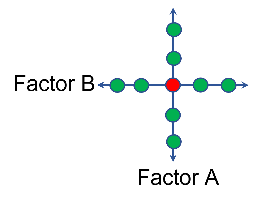
Figure 3: OFAT
A face-centered central composite design (CCD)—a response surface method (RSM)—has factorial (corner) points that define the region of interest (see Figure 4 – added blue dots). These points are used to estimate the linear and the interaction effects for the factors. The center point and mid points of the edges are used to estimate nonlinear (squared) terms.
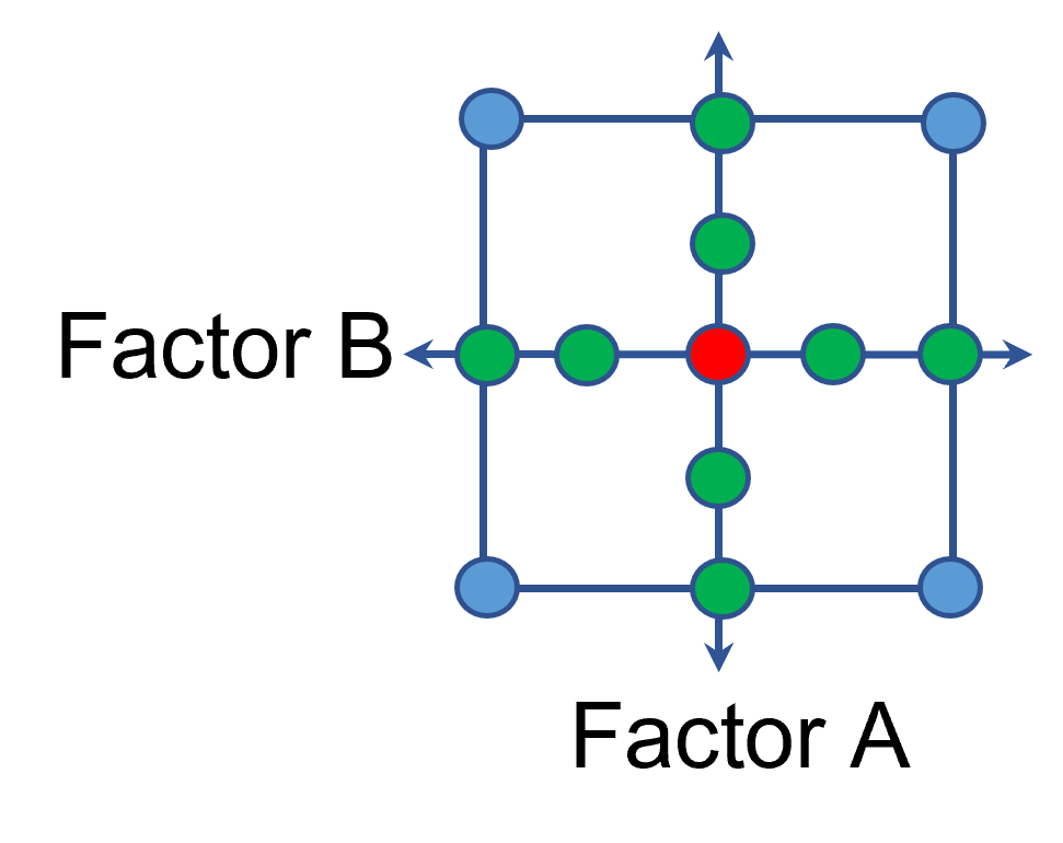
Figure 4: Face-Centered CCD
If an experimenter has completed the OFAT portion of the design, they can augment the existing data by adding the corner points and then analyzing as a full response surface design. This set of data can now estimate up to the full quadratic polynomial. There will likely be extra points from the original OFAT runs, which although not needed for model estimation, do help reduce the standard error of the predictions.
Running a statistically designed experiment from the start will reduce the overall experimental resources. But it is good to recognize that existing data can be augmented to gain valuable insights!
Learn more about design augmentation at the January webinar: The Art of Augmentation – Adding Runs to Existing Designs.