Stat-Ease Blog

Categories
Hear Ye, Hear Ye: A Response Surface Method (RSM) Experiment on Sound Produces Surprising Results
A few years ago, while evaluating our training facility in Minneapolis, I came up with a fun experiment that demonstrates a great application of RSM for process optimization. It involves how sound travels to our students as a function of where they sit. The inspiration for this experiment came from a presentation by Tom Burns of Starkey Labs to our 5th European DOE User Meeting. As I reported in our September 2014 Stat-Teaser, Tom put RSM to good use for optimizing hearing aids.
Background
Classroom acoustics affect speech intelligibility and thus the quality of education. The sound intensity from a point source decays rapidly by distance according to the inverse square law. However, reflections and reverberations create variations by location for each student—some good (e.g., the Whispering Gallery at Chicago Museum of Science and Industry—a very delightful place to visit, preferably with young people in tow), but for others bad (e.g., echoing). Furthermore, it can be expected to change quite a bit from being empty versus fully occupied. (Our then-IT guy Mike, who moonlights as a sound-system tech, called these—the audience, that is—“meat baffles”.)
Sound is measured on a logarithmic scale called “decibels” (dB). The dBA adjusts for varying sensitivities of the human ear.
Frequency is another aspect of sound that must be taken into account for acoustics. According to Wikipedia, the typical adult male speaks at a fundamental frequency from 85 to 180 Hz. The range for a typical adult female is from 165 to 255 Hz.
Procedure

Stat-Ease training room at one of our old headquarters—sound test points spotted by yellow cups.
This experiment sampled sound on a 3x3 grid from left to right (L-R, coded -1 to +1) and front to back (F-B, -1 to +1)—see a picture of the training room above for location—according to a randomized RSM test plan. A quadratic model was fitted to the data, with its predictions then mapped to provide a picture of how sound travels in the classroom. The goal was to provide acoustics that deliver just enough loudness to those at the back without blasting the students sitting up front.
Using sticky notes as markers (labeled by coordinates), I laid out the grid in the Stat-Ease training room across the first 3 double-wide-table rows (4th row excluded) in two blocks:
- 2² factorial (square perimeter points) with 2 center points (CPs).
- Remainder of the 32 design (mid-points of edges) with 2 additional CPs.
I generated sound from the Online Tone Generator at 170 hertz—a frequency chosen to simulate voice at the overlap of male (lower) vs female ranges. Other settings were left at their defaults: mid-volume, sine wave. The sound was amplified by twin Dell 6-watt Harman-Kardon multimedia speakers, circa 1990s. They do not build them like this anymore 😉 These speakers reside on a counter up front—spaced about a foot apart. I measured sound intensity on the dBA scale with a GoerTek Digital Mini Sound Pressure Level Meter (~$18 via Amazon).
Results
I generated my experiment via the Response Surface tab in Design-Expert® software (this 3³ design shows up under "Miscellaneous" as Type "3-level factorial"). Via various manipulations of the layout (not too difficult), I divided the runs into the two blocks, within which I re-randomized the order. See the results tabulated below.
| Block | Run | Space Type | Coordinate (A: L-R) | Coordinate (B: F-B) | Sound (dBA) |
|---|---|---|---|---|---|
| 1 | 1 | Factorial | -1 | 1 | 70 |
| 1 | 2 | Center | 0 | 0 | 58 |
| 1 | 3 | Factorial | 1 | -1 | 73.3 |
| 1 | 4 | Factorial | 1 | 1 | 62 |
| 1 | 5 | Center | 0 | 0 | 58.3 |
| 1 | 6 | Factorial | -1 | -1 | 71.4 |
| 1 | 7 | Center | 0 | 0 | 58 |
| 2 | 8 | CentEdge | -1 | 0 | 64.5 |
| 2 | 9 | Center | 0 | 0 | 58.2 |
| 2 | 10 | CentEdge | 0 | 1 | 61.8 |
| 2 | 11 | CentEdge | 0 | -1 | 69.6 |
| 2 | 12 | Center | 0 | 0 | 57.5 |
| 2 | 13 | CentEdge | 1 | 0 | 60.5 |
Notice that the readings at the center are consistently lower than around the edge of the three-table space. So, not surprisingly, the factorial model based on block 1 exhibits significant curvature (p<0.0001). That leads to making use of the second block of runs to fill out the RSM design in order to fit the quadratic model. I was hoping things would play out like this to provide a teaching point in our DOESH class—the value of an iterative strategy of experimentation.
The 3D surface graph shown below illustrates the unexpected dampening (cancelling?) of sound at the middle of our Stat-Ease training room.
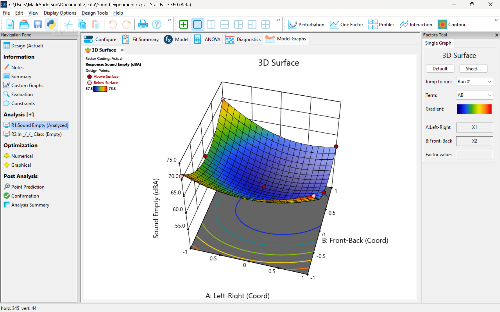
3D surface graph of sound by classroom coordinate.
Perhaps this sound ‘map’ is typical of most classrooms. I suppose that it could be counteracted by putting acoustic reflectors overhead. However, the minimum loudness of 57.4 (found via numeric optimization and flagged over the surface pictured) is very audible by my reckoning (having sat in that position when measuring the dBA). It falls within the green zone for OSHA’s decibel scale, as does the maximum of 73.6 dBA, so all is good.
What next
The results documented here came from an empty classroom. I would like to do it again with students (aka meat baffles) present. I wonder how that will affect the sound map. Of course, many other factors could be tested. For example, Rachel from our Front Office team suggested I try elevating the speakers. Another issue is the frequency of sound emitted. Furthermore, the oscillation can be varied—sine, square, triangle and sawtooth waves could be tried. Other types of speakers would surely make a big difference.
What else can you think of to experiment on for sound measurement? Let me know.
Like the blog? Never miss a post - sign up for our blog post mailing list.
Perfecting pound cake via mixture design for optimal formulation
Thanksgiving is fast approaching—time to begin the meal planning. With this in mind, the NBC Today show’s October 22nd tips for "75 Thanksgiving desserts for the sweetest end to your feast" caught my eye, in particular the Donut Loaf pound cake. My 11 grandkids would love this “giant powdered sugar donut” (and their Poppa, too!).
I became a big fan of pound cake in the early 1990s while teaching DOE to food scientists at Sara Lee Corporation. Their ready-made pound cakes really hit the spot. However, it is hard to beat starting from scratch and baking your own pound cake. The recipe goes backs hundreds of years to a time when many people could not read, thus it simply called for a pound each of flour, butter, sugar and eggs. Not having a strong interest in baking and wanting to minimize ingredients and complexity (other than adding milk for moisture and baking powder for tenderness), I made this formulation my starting point for a mixture DOE, using the Sara Lee classic pound cake as the standard for comparison.
As I always advise Stat-Ease clients, before designing an experiment, begin with the first principles. I took advantage of my work with Sara Lee to gain insights on the food science of pound cake. Then I checked out Rose Levy Beranbaum’s The Cake Bible from my local library. I was a bit dismayed to learn from this research that the experts recommended cake flour, which costs about four times more than the all-purpose (AP) variety. Having worked in a flour mill during my time at General Mills as a process engineer, I was skeptical. Therefore, I developed a way to ‘have my cake and eat it too’: via a multicomponent constraint (MCC), my experiment design incorporated both varieties of flour. Figure 1 shows how to enter this in Stat-Ease software.

Figure 1. Setting up the pound cake experiment with a multicomponent constraint on the flours
By the way, as you can see in the screen shot, I scaled back the total weight of each experimental cake to 1 pound (16 ounces by weight), keeping each of the four ingredients in a specified range with the MCC preventing the combined amount of flour from going out of bounds.
The trace plot shown in Figure 2 provides the ingredient directions for a pound cake that pleases kids (based on tastes of my young family of 5 at the time) are straight-forward: more sugar, less eggs and go with the cheap AP flour (its track not appreciably different than the cake flour.)

Figure 2. Trace plot for pound cake experiment
For all the details on my pound cake experiment, refer to "Mixing it up with Computer-Aided Design"—the manuscript for a publication by Today's Chemist at Work in their November 1997 issue. This DOE is also featured in “MCCs Made as Easy as Making a Pound Cake” in Chapter 6 of Formulation Simplified: Finding the Sweet Spot through Design and Analysis of Experiments with Mixtures.
The only thing I would do different nowadays is pour a lot of powdered sugar over the top a la the Today show recipe. One thing that I will not do, despite it being so popular during the Halloween/Thanksgiving season, is add pumpkin spice. But go ahead if you like—do your own thing while experimenting on pound cake for your family’s feast. Happy holidays! Enjoy!
To learn more about MCCs and master DOE for food, chemical, pharmaceutical, cosmetic or any other recipe improvement projects, enroll in a Stat-Ease “Mixture Design for Optimal Formulations” public workshop or arrange for a private presentation to your R&D team.
The Design and Analysis of Launching Cats
Hi folks! It was wonderful to meet with so many new prospects and long-standing clients at the Advanced Manufacturing Minneapolis expo last week. One highlight of the show was running our own design of experiments (DOE) in-booth: a test to pinpoint the height and distance of a foam cat launched from our Cat-A-Pult toy. Visitors got to choose a cat and launch it based on our randomized run sheet. We got lots of takers coming in to watch the cats fly, and we even got a visit from local mascot Goldy Gopher!

Mark, Tony, and Rachel are all UMN alums - go Gophers!
But I’m getting a bit ahead of myself: this experiment primarily shows off the ease of use and powerful analytical capabilities of Design-Expert® and Stat-Ease® 360 software. I’m no statistician – the last math class I took was in high school, over a decade ago – but even a marketer like me was able to design, run, and analyze a DOE with just a little advice. Here’s how it worked.
Let’s start at the beginning, with the design. My first task was to decide what factors I wanted to test. There were lots of options! The two most obvious were the built-in experimental parts of the toy: the green and orange knobs on either side of the Cat-A-Pult, with spring tension settings from 1 to 5.

However, there were plenty of other places where there could be variation in my ‘pulting system:
- The toy comes with 5 Cat-A-Pults: are there variations between each 'pult?
- Does it matter what kind of surface the Cat-A-Pult is on, e.g., wood, concrete, or carpet?
- The toy came with 5 colors of foam cat; would the pigment change the cat’s weight enough to matter?
- What about where on the plate we apply launch pressure, or how much pressure is applied?
Some of these questions can be answered with subject matter knowledge – in the case of launch pressure, by reading the instruction manual.

For our experiment, the surface question was moot: we had no way to test it, as the convention floor was covered in carpet. We also had no way to test beforehand if there were differences in mass between colors of cat, since we lacked a tool with sufficient precision. I settled on just testing the experimental knobs, but decided to account for some of this variation in other ways. We divided the experiment into blocks based on which specific Cat-A-Pult we were using, and numbered them from 1 to 5. And, while I decided to let people choose their cat color to enhance the fun aspect, we still tracked which color of cat was launched for each run - just in case.
Since my chosen two categoric factors had five levels each, I decided to use the Multilevel Categoric design tool to set up my DOE. One thing I learned from Mark is that these are an “ordinal” type of categoric factor: there is an order to the levels, as opposed to a factor like the color of the cat or the type of flooring (a “nominal” factor). We decided to just test 3 of the 5 Cat-A-Pults, trying to be reasonable about how many folks would want to play with the cats, so we set the design to have 3 replicates separated out into 3 blocks. This would help us identify if there were any differences between the specific Cat-A-Pults.

For my responses, I chose the Cat-A-Pult’s recommended ones: height and distance. My Stat-Ease software then gave me the full, 5x5, 25-run factorial design for this, with a total of 75 runs for the 3 replicates blocked by 'pult, meaning we would test every combination of green knob level and orange knob level on each Cat-A-Pult. More runs means more accurate and precise modeling of our system, and we expected to be able to get 75 folks to stop by and launch a cat.
And so, armed with my run sheet, I set up our booth experiment! I brought two measuring tapes for the launch zone: one laid along the side of it to measure distance, and one hanging from the booth wall to measure height. My measurement process was, shall we say, less than precise: for distance, the tester and I eyeballed the point at which the cat first landed after launch, then drew a line over to our measuring tape. For height, I took a video of the launch, then scrolled back to the frame at the apex of the cat’s arc and once again eyeballed the height measurement next to it. In addition to blocking the specific Cat-A-Pult used, we tracked which color of cat was selected in case that became relevant. (We also had to append A and B to the orange cat after the first orange cat was mistaken for swag!)

Whee! I'm calling that one at 23 inches.
Over the course of the conference, we completed 50 runs, getting through the full range of settings for ‘pults 1 and 2. While that’s less than we had hoped, it’s still plenty for a good analysis. I ran the analysis for height, following the steps I learned in our Finding the Vital Settings via Factorial Analysis eLearning module.


The half-normal plot of effects and the ANOVA table for Height.
The green knob was the only significant effect on Height, but the relatively low Predicted R² model-fit-statistic value of 0.36 tells us that there’s a lot of noise that the model doesn’t explain. Mark directed me to check the coefficients, where we discovered that there was a 5-inch variation in height between the two Cat-A-Pult! That’s a huge difference, considering that our Height response peaked at 27 inches.
With that caveat in mind, we looked at the diagnostic plots and the one-factor plot for Height. The diagnostics all looked fine, but the Least Significant Difference bars showed us something interesting: there didn’t seem to be significant differences between setting the green knob at 1-3, or between settings 4-5, but there was a difference between those two groups.

One-factor interaction plot for Height.
With this analysis under my belt, I moved on to Distance. This one was a bit trickier, because while both knobs were clearly significant to the model, I wasn’t sure whether or not to include the interaction. I decided to include it because that’s what multifactor DOE is for, as opposed to one-factor-at-a-time experimentation: we’re trying to look for interactions between factors. So once again, I turned to the diagnostics.

The three main diagnostic plots for Distance.
Here's where I ran into a complication: our primary diagnostic tools told me there was something off with our data. There’s a clear S-shaped pattern in the Normal Plot of Residuals and the Residuals vs. Predicted graph shows a slight megaphone shape. No transform was recommended according to the Box-Cox plot, but Mark suggested I try a square-root transform anyways to see if we could get more of the data to fit the model. So I did!

The diagnostics again, after transforming.
Unfortunately, that didn’t fix the issues I saw in the diagnostics. In fact, it revealed that there’s a chance two of our runs were outliers: runs #10 and #26. Mark and I reviewed the process notes for those runs and found that run #10 might have suffered from operator error: he was the one helping our experimenter at the booth while I ran off for lunch, and he reported that he didn’t think he accurately captured the results the way I’d been doing it. With that in mind, I decided to ignore that run when analyzing the data. This didn’t result in a change in the analysis for Height, but it made a large difference when analyzing Distance. The Box-Cox plot recommended a log transform for analyzing Distance, so I applied one. This tightened the p-value for the interaction down to 0.03 and brought the diagnostics more into line with what we expected.

The two-factor interaction plot for Distance.
While this interaction plot is a bit trickier to read than the one-factor plot for Height, we can still clearly see that there’s a significant difference between certain sets of setting combinations. It’s obvious that setting the orange knob to 1 keeps the distance significantly lower than other settings, regardless of the green knob’s setting. The orange knob’s setting also seems to matter more as the green knob’s setting increases.
Normally, this is when I’d move on to optimization, and figuring out which setting combinations will let me accurately hit a “sweet spot” every time. However, this is where I stopped. Given the huge amount of variation in height between the two Cat-A-Pults, I’m not confident that any height optimization I do will be accurate. If we’d gotten those last 25 runs with ‘pult #3, I might have had enough data to make a more educated decision; I could set a Cat-A-Pult on the floor and know for certain that the cat would clear the edge of the litterbox when launched! I’ll have to go back to the “lab” and collect more data the next time we’re out at a trade show.
One final note before I bring this story to a close: the instruction manual for the Cat-A-Pult actually tells us what the orange and green knobs are supposed to do. The orange knob controls the release point of the Cat-A-Pult, affecting the trajectory of the cat, and the green knob controls the spring tension, affecting the force with which the cat is launched.

I mentioned this to Mark, and it surprised us both! The intuitive assumption would be that the trajectory knob would primarily affect height, but the results showed that the orange knob’s settings didn’t significantly affect the height of the launch at all. “That,” Mark told me, “is why it’s good to run empirical studies and not assume anything!”
We hope to see you the next time we’re out and about. Our next planned conference is our 8th European DOE User Meeting in Amsterdam, the Netherlands on June 18-20, 2025. Learn more here, and happy experimenting!
Tips and tools for modeling counts most precisely
In a previous Stat-Ease blog, my colleague Shari Kraber provided insights into Improving Your Predictive Model via a Response Transformation. She highlighted the most commonly used transformation: the log. As a follow up to this article, let’s delve into another transformation: the square root, which deals nicely with count data such as imperfections. Counts follow the Poisson distribution, where the standard deviation is a function of the mean. This is not normal, which can invalidate ordinary-least-square (OLS) regression analysis. An alternative modeling tool, called Poisson regression (PR) provides a more precise way to deal with count data. However, to keep it simple statistically (KISS), I prefer the better-known methods of OLS with application of the square root transformation as a work-around.
When Stat-Ease software first introduced PR, I gave it a go via a design of experiment (DOE) on making microwave popcorn. In prior DOEs on this tasty treat I worked at reducing the weight of off-putting unpopped kernels (UPKs). However, I became a victim of my own success by reducing UPKs to a point where my kitchen scale could not provide adequate precision.
With the tools of PR in hand, I shifted my focus to a count of the UPKs to test out a new cell-phone app called Popcorn Expert. It listens to the “pops” and via the “latest machine learning achievements” signals users to turn off their microwave at the ideal moment that maximizes yield before they burn their snack. I set up a DOE to compare this app against two optional popcorn settings on my General Electric Spacemaker™ microwave: standard (“GE”) and extended (“GE++”). As an additional factor, I looked at preheating the microwave with a glass of water for 1 minute—widely publicized on the internet to be the secret to success.
Table 1 lays out my results from a replicated full factorial of the six combinations done in random order (shown in parentheses). Due to a few mistakes following the software’s plan (oops!), I added a few more runs along the way, increasing the number from 12 to 14. All of the popcorn produced tasted great, but as you can see, the yield varied severalfold.
| A: | B: | UPKs | ||
|---|---|---|---|---|
| Preheat | Timing | Rep 1 | Rep 2 | Rep 3 |
| No | GE | 41 (2) | 92 (4) | |
| No | GE++ | 23 (6) | 32 (12) | 34 (13) |
| No | App | 28 (1) | 50 (8) | 43 (11) |
| Yes | GE | 70 (5) | 62 (14) | |
| Yes | GE++ | 35 (7) | 51 (10) | |
| Yes | App | 50 (3) | 40 (9) |
I then analyzed the results via OLS with and without a square root transformation, and then advanced to the more sophisticated Poisson regression. In this case, PR prevailed: It revealed an interaction, displayed in Figure 1, that did not emerge from the OLS models.

Figure 1: Interaction of the two factors—preheat and timing method
Going to the extended popcorn timing (GE++) on my Spacemaker makes time-wasting preheating unnecessary—actually producing a significant reduction in UPKs. Good to know!
By the way, the app worked very well, but my results showed that I do not need my cell phone to maximize the yield of tasty popcorn.
To succeed in experiments on counts, they must be:
- discrete whole numbers with no upper bound
- kept with within over a fixed area of opportunity
- not be zero very often—avoid this by setting your area of opportunity (sample size) large enough to gather 20 counts or more per run on average.
For more details on the various approaches I’ve outlined above, view my presentation on Making the Most from Measuring Counts at the Stat-Ease YouTube Channel.
Addicted to DX
Your computer's on, you're data's in
Your mind is lost amidst the din
Your palms sweat, your keyboard shakes
Another transform is what it takes
You can't sleep, you can't eat
You have runs, you must repeat
You squeeze the mouse, it starts to squeak
A new analysis will look less bleak
Whoa, you like to think that you're immune to the stats, oh yeah
It's closer to the truth to say you need your fix
You know you're gonna have to face it, you're addicted to Dee Ex