Note
Screenshots may differ slightly depending on software version.
Mixture Design
Part 1 - The Basics
Introduction
In this tutorial you are introduced to mixture design. If you are in a hurry to learn about mixture design and analysis, bypass the Note sections. However, if/when you can circle back, takes advantage of these educational sidetracks.
Note
Mixture design is really a specialized form of response surface methods (RSM). To keep this tutorial to the point, we will not go back over features detailed in the RSM tutorials so you’d best either work through these first, or do so after completing this one on mixtures. Otherwise you will remain ignorant of many useful features and miss out on important nuances in interpreting outputs.
To gain a full working knowledge of this powerful tool, we recommend you attend our workshop on Mixture Design for Optimal Formulations. Call Stat-Ease or visit our website at www.statease.com for a schedule. For a free primer on mixture design, go to the Stat-Ease home page and follow Learn DOE, Quick Start Resources to the link that says “I’m a formulator.”
This tutorial demonstrates only essential program functions. For more details, check our extensive Help system, accessible at any time by pressing F1. Its search capability makes it easy for you to find the information you need.
The Case Study – Formulating a Detergent
A detergent must be re-formulated to fine-tune two product attributes, which are measured as responses from a designed experiment:
Y1 - viscosity
Y2 - turbidity.
Three primary components vary as shown:
3% ≤ A (water) ≤ 8%
2% ≤ B (alcohol) ≤ 4%
2% ≤ C (urea) ≤ 4%
These components represent nine weight-percent of the total formulation, that is:
A + B + C = 9%
Other materials (held constant) make up the difference: 91 weight-percent of the detergent. For purposes of this experiment they are ignored.
Experimenters chose a standard mixture design called a simplex lattice. They augmented this design with axial check blends and the overall centroid. Vertices and overall centroid were replicated, increasing the experiment size to 14 blends total.

Augmented simplex lattice (second degree)
This case study leads you through all the steps of design and analysis for mixtures. The next tutorial, Part 2, instructs how to simultaneously optimize the two responses.
Design the Experiment
Initiate a new design by clicking New Design on the opening screen. Click the Mixture section on the left. The design you want, a simplex lattice, comes up by default.

Choosing a mixture design
Note
Some on-screen details appear, but more are available by pressing
the screen tips button ![]() . Check this out! Close Tips and explore
Help, Contents next. Click Designs, then Mixture Designs.
. Check this out! Close Tips and explore
Help, Contents next. Click Designs, then Mixture Designs.
Now change the number of Mixture Components to 3. Enter components and their limits as shown below in all Name, Low, and High fields, pressing the Tab key after each entry. Enter 9 in the Total field and % as your Units.

Entering components, limits, and total
Press Next. Immediately a warning appears.

Adjustment made to constraints
Press OK. Notice that although you entered the high limit for water as 8%, the program adjusts it to 5% — leaving room for 2% each of the other two ingredients within the 9% total. Otherwise, at 8%, water and the low levels of alcohol and urea would total 12%. The program recognizes that this does not compute. Very helpful!
Note
For many mixture designs you may be warned at this point that it cannot fit a simplex.

Warning that comes up if mixture region is not a simplex
You should then shift to the Optimal design choice. See this option detailed in the Optimal Numeric tutorial.
Press Next and the software’s adjustment lets you move on. Now you must choose the order of the model you expect is appropriate for the system being studied. In this case, assume that a quadratic polynomial, which includes second-order terms for curvature, will adequately model the responses. Therefore, leave the order at Quadratic. Keep the default check-mark at “Augment design” but change Number of runs to replicate to 3.

Simplex-lattice design form (after pressing Tab key)
By keeping (accepting) the “Augment design” check-mark, you allow the program to add the overall centroid and axial check blends to the design points.
Note
The “Number of runs to replicate” field, which had defaulted to 4, causes the specified number of experiments to be duplicated. In this case, there are three points that are duplicated – the vertices of the triangular simplex. This makes the fourth replicate a bit awkward because it creates an imbalance in the design. Feel free to try this and see for yourself. Then rebuild the design saying “Yes” to Use previous design info” — thus preserving your typing of component names, etc.
Press Next to proceed to the next step in the design process. Change the number of Responses to 2. Then enter all response Names and Units as shown below.

Response entries
Up to now you’ve been able to click the Back button at the lower right of your screen and move through the design forms to change requirements. When you press Finish on this page, the program completes the design setup for you.
Modify the Design
To top off this experiment design let’s replicate the centroid. In the Design layout right click the Select column header at the upper-left corner and pick Design ID. Go back and also Select (display) the Space Point Type column. This is very helpful for insights about design geometry.

Adding columns to design layout via the Select option (right-click menu)
Next, double-click the column header labeled Id, to Sort Ascending. Now your screen should match that below except for the randomized run numbers.

Initial design sorted by ID with point type shown (run order randomized)
The experimenters ran an additional centroid point, so in the box to the left of Id 0 (point type = “Center”) right-click and select Duplicate.

Duplicating the centroid
Whenever you insert, delete, or duplicate rows, always right-click the Run column header and choose Randomize.

Re-randomizing the run order
After randomization, the Run column is automatically sorted in ascending order.
Save Your Work
Because you’ve invested time into your design, it is prudent to save your work. Click File then Save As. The program displays a standard file dialog box. Use it to specify the name and destination of your data file. Enter a file name in the field with default extension dxpx. (We suggest tut-mix.) Click Save.
Analyze the Results
Assume your experiments are completed. You now need to enter responses into the software. For tutorial purposes, we see no benefit to making you type all the numbers. So to save time, read the response data in by going to Help, Tutorial Data and selecting Detergent. Now click on the Design node on the left. You now should be displaying the response data shown below.
There’s no need for typing in this case, but normally you’d have invested much more work by this stage and it would be a good idea to save.

Ready-made response data
Go to the Analysis branch and click the Viscosity node. Then press the Start Analysis button. Let’s progress through the tabs atop the window.

First step in analysis: Transformation options
First, consider doing a transformation on the response. In some cases this improves the statistical properties of the analysis. For example, when responses vary over several orders of magnitude, the log scale usually works best. In this case the ratio of maximum to minimum response is only a bit over 4, which isn’t excessive (see detail at bottom of the screen), so leave the selection at its default, None, because no transformation is needed. Also, leave the coding for analysis as pseudo because this re-scales the actual component levels to 0 – 1.
Note
For complete details on pseudo and other coding for mixture models, see the primer mentioned at the outset of this tutorial. In the meantime, see the help topic Component Scaling in Mixture Designs.
Next click the Fit Summary tab. Here the program fits linear, quadratic, special cubic, and full cubic polynomials to the response.

Fit summary reports
To begin your analysis, look for any warnings about aliasing. In this case, the full cubic model and beyond could not be estimated by the chosen design — an augmented simplex design. Remember, you chose only to fit a quadratic model, so this should be no surprise.
Next, pay heed to the model suggested in the first table in bold, which re-caps what’s detailed below.
Now move over to the Sequential Model Sum of Squares breakdown (location will vary based on pane layout).

Sequential models sum of squares table
Analysis proceeds from a basis of the mean response. This is the default model if none of the factors causes a significant effect on the response. The output then shows the significance of each set of additional terms. Notice that below the level where the program says “Suggested” the p-values become insignificant (>0.05), thus there is no advantage to adding further terms.
Note
Here’s a line-by-line detailing of the sum of squares:
“Linear vs Mean”: the significance of adding the linear terms after accounting for the mean. (Due to the constraint that the three components must sum to a fixed total, you will see only two degrees of freedom associated with the linear mixture model.)
“Quadratic vs Linear”: the significance of adding the quadratic terms to the linear terms already in the model.
“Sp Cubic vs Quadratic”: the contribution of the special cubic terms beyond the quadratic and linear terms.
“Cubic vs Sp Cubic”: the contribution of the full cubic terms beyond the special cubic, quadratic, and linear terms. (In this case, these terms are aliased.)
And so on….
For each set of terms, probability (“Prob > F”) should be examined to see if it falls below 0.05 (or whatever statistical significance level you choose). Adding terms up to quadratic significantly improves this particular model, but when you get to the special cubic level, there’s no further improvement. The program automatically underlines at least one “Suggested” model. Always confirm this suggestion by reviewing all tables under Fit Summary.
Now click the Lack of Fit Tests tab to move on to the next pane. This table compares residual error with pure error from replication. If residual error significantly exceeds pure error, then deviations remain in the residuals that can be removed using a more appropriate model. Residual error from the linear model shows significant lack of fit (this is bad), while quadratic, special cubic, and full cubic do not show significant lack of fit (this is good).

Lack of fit table
At this point, the quadratic model statistically looks very good indeed.
Now click Model Summary Statistics. Here you see several comparative measures for model selection.

Summary statistics
Ignoring the aliased cubic model, the quadratic model comes out best: low standard deviation (“Std Dev”), high “R-Squared” statistics, and low “PRESS.”
Before moving on, you may want to print the Fit Summary tables via File, Print. These tables, or any selected subset, can be cut and pasted into a word processor, spreadsheet, or any other application. You’re now ready to take an in-depth look at the quadratic model.
Model Selection and Analysis of Variance (ANOVA)
Click the Model tab atop the screen to see the model suggested by the program.

Choosing the model
Note
You may select models other than this defaulting quadratic model from the pull down list. (Be sure to do this in the rare cases when Stat-Ease suggests more than one model.) On the current screen you are allowed to manually reduce the model by clicking off terms that are not statistically significant. For example, in this case, you will see in a moment that the AB term is not statistically significant.
Also, as noted in the Tips screen, Stat-Ease provides several automatic reduction algorithms as alternatives to “Manual” which can be accessed via the Auto Select… button. Click that button if you’d like to try one. You will see a recommendation pop up on what works best as a general rule. However, we recommend you not reduce mixture models unless you’re sure, based on statistical and subject-matter knowledge, that this makes sense. If you really want to be competent on this, attend our Mixture Design for Optimal Formulations workshop.
Press the ANOVA button for details about the quadratic model.

ANOVA report with annotations on
The statistics look very good.
Note
The model has a high F value and low probability values (Prob > F). That is good as you will infer from the annotation. The probability values show the significance of each term.
P.S. Because the mixture model does not contain an intercept term, the main effect coefficients (linear terms) incorporate the overall average response and are tested together.
Move over to the next report – Fit Statistics.

R-squared and other statistics after the ANOVA
These statistics, many of which you’ve already seen in the “Model Summary Statistics” table, all look good. Note the more than adequate precision (Adeq Precision) value of 27.943.
Next, view the coefficients and associated confidence intervals for the quadratic model.

Coefficients for the quadratic model
Note
Continue further to see several models that vary only by how components are coded. The annotations provide ideas on how they differ due to the coding.
Continue on to the next tab from ANOVA — Diagnostics.
Diagnose the Statistical Properties of the Model
The normal probability plot of the residuals, comes up in the first pane by default.

Normal Probability Plot of Residuals
The data points should be approximately linear. A non-linear pattern (such as an S-shaped curve) indicates non-normality in the error term, which may be corrected by a transformation. There are no signs of any problems in our data.
Note
At the top of the screen you see the Diagnostics Toolbar. Be aware that residuals are externally studentized unless you elect otherwise (not advised). Studentization counteracts varying leverages due to design point locations. For example, center points carry little weight in the fit and thus exhibit low leverage. Externalizing the residuals isolates each one in comparison to the others so discrepant results stand out more.
To bring up bring up case-by-case details on many of the statistics you can see on the graphs for diagnostic purposes: Move to Report.

Report
Notice that one value is flagged in blue (and with an asterisk) for exceeding suggested limits: DFFITs for standard order 11. As detailed in the Help, this statistic stands for difference in fits. It measures change in each predicted value that occurs when that response is deleted. Given that only this one diagnostic is flagged, it probably is not a cause for alarm. However, observe that it’s one of the highest viscosity responses (Actual Value = 130.00), so the experimenter might want to double-check the accuracy of this response.
Examine Model Graphs
The residuals diagnosis reveals no statistical problems, so now let’s generate response surface plots. Click the Model Graphs tab. The 2D contour plot comes up by default in graduated color shading.

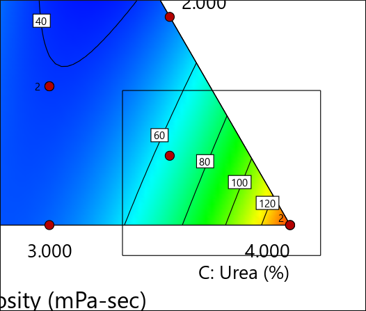
Response surface contour plot
Note that Stat-Ease displays any actual point included in the design space. In this case you see a plot of viscosity as a function of the three mixture components. This slice includes two centroids as indicated by the red dot and the number “2” at the middle of the contour plot.
Note
The Factors Tool displays along with the default plot. Move this floating tool as needed by clicking on the top border (title bar) and dragging it. The tool controls which factor(s) are plotted on the graph. Each component listed has either an axis label, indicating that it is currently appearing on the graph, or a slider bar, which allows you to choose specific settings for those not currently plotted. This case study involves only three components, all of which fit on one mixture plot – a ternary diagram. Therefore, you do not see any slider bars. If you did, they would default to the midpoint levels of the components not currently assigned to axes. You could then change a level by dragging the slider bars left or right. If you’d like to see a demonstration of this feature, work through the Response Surface Tutorial (Part 1 – The Basics).
Place your mouse cursor over the contour graph. Observe how it turns into a cross (+). Then notice in the lower-left corner of the screen that Stat-Ease displays the predicted response and coordinates.

Coordinates display at lower-left corner of screen
To enable a handier tool for reading coordinates off contour plots, go to View, Show Crosshairs Window.

Showing crosshairs window
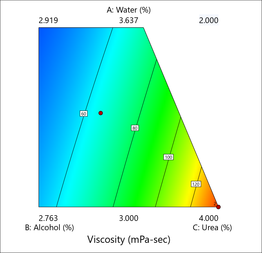
Now move your mouse over the contour plot and notice that the program generates the predicted response for specific values of the factors that correspond to that point. If you place the crosshair over an actual point, for example, the checkblend midway between the centroid and the upper vertex (corner labeled “A”), you also see the observed value (in this case: 35.100) as shown below.

Prediction where an actual run was performed
Note
Press the Full button to see confidence and prediction intervals in addition to the coordinates and predicted response, as shown below.

Full Crosshairs display
Close the crosshairs window.
Zooming In and Out
Let’s say you’re interested in highest values for viscosity. With your left mouse button held down, drag over the lower right corner of the contour graph.
Corner identified for zoom
Now the area you chose is magnified.
Zoomed-in area on contour plot
To revert to the full triangle plot, right-click anywhere over the plot and select Default View Window.

Default view window
Note
Many more features are available to modify the look of contour plots. These are detailed in the Response Surface (pt3) tutorial, Tips and Tricks for Making Response Graphs Most Presentable.
Trace Plot
Wouldn’t it be handy to see all your factors on one response plot? You can do this with the trace plot, which provides silhouette views of the response surface. The real benefit from this plot is for selecting axes and constants in contour and 3D plots. From the Graphs Toolbar select Trace. Trace plots show the effects of changing each component along an imaginary line from the reference blend (defaulted to the overall centroid) to the vertex. For example, click on the curve for A and it changes color.

Trace plot – component A highlighted
Notice that viscosity (the response) is not very sensitive to this component.
Note
In this case, where the experimental region forms a simplex, it matters little which direction you take. Check this out by going to View > Trace Direction and selecting Cox. In the Cox direction, as the amount of any component increases, the amounts of all other components decrease, but their ratio to one another remains constant. Chemists may like this because it preserves the reaction stoichiometry. However, when plotted in this direction, traces for highly constrained mixture components (such as a catalyst for a chemical reaction) become truncated. Thus, mixture-design experts argue that although it no longer holds actual ratios constant, Piepel’s direction provides a more helpful plot by providing the broadest coverage of the experimental space. For this reason Piepel is the preferred plot in Stat-Ease. For more detail, search in Help for “trace plot”.
P.S. Trace plots depend greatly on where you place the starting point (by default the centroid). See for yourself by moving slide bars on the Factors Tool. When you are done, press the Default button. Consider that the traces are one-dimensional only, and thus cannot provide a very useful view of a response surface. A 3D response plot paints a better picture of the surface. It’s the ultimate tool for determining the most desirable mixture composition.
If you experiment on more than three mixture components, use the trace plot to find those components that most affect the response. Choose these influential components for the axes on the contour plots. Set as constants those components that create relatively small effects. Your 2D contour and 3D plots will then be sliced in ways that are most visually interesting.
Note
When you have more than three components to plot, the program uses the composition at the optimum as the default for the remaining constant axes. For example, if you design for four components, the experimental space is a tetrahedron. Within this three-dimensional space you may find several optimums, which require multiple triangular “slices,” one for each optimum.
Generating a 3D View of the Response Surface
Now to really get a feel for how response varies as a function of the two factors chosen for display, select View, 3D Surface. A three-dimensional display of the response surface appears. If coordinates encompass actual design points, these emerge.

3D response surface plot
You can rotate the 3D plot directly by grabbing it with your mouse. It turns into a hand when placed over the graph. Then click and hold the left mouse-button and drag. Try it!
When you’re done spinning the graph around, click Default on the Factors Tool. The graph then re-sets to its original settings.
Note
Right-click the graph and select Set Rotation for a tool that makes it easy to view 3D surface plots from any angle.

Control for rotating 3D plot
Notice that you can specify precise horizontal (“h”) and vertical (“v”) coordinates. Give this a try. Then press Default and X off the view of Rotation tool.
Stat-Ease offers many options for 3D graphs via its Graph Preferences, which come up with a right-click over the plot. For example, if you don’t like graduated colors, go to the Surface Graphs tab and change 3D graph shading to wire frame view (a transparent look).
Response Prediction
Response prediction falls under the Post Analysis branch, which will be explored more fully in the next tutorial in this series. It allows you to generate predicted response(s) for any set of factors. To see how this works, click the Point Prediction node.

Point Prediction
You now see the predicted responses from this particular blend - the centroid. The Factors Tool opens along with the Point Prediction Tool. Move the tool as needed by clicking and dragging the top border. You can also drag the handy sliders on the component gauges to view other blends. Note that in a mixture you can only vary two of the three components independently. Can you find a combination that produces viscosity of 43? (Hint: push Urea up a tiny bit.) Don’t try too hard, because in the next section of this tutorial you will make use of the optimization features to accomplish this objective.
Note
Click the Sheet button to get a convenient entry form for specific component values. Be careful though, because the ingredients must add up to the fixed total you specified earlier: 9 wt %. The program makes adjustments as you go — perhaps in ways you do not anticipate. Don’t worry: If you get too far off, simply press Default to return to the centroid.
Analyze the Data for the Second Response
This last step is a BIG one. Analyze the data for the second response, turbidity (Y2). Be sure you find the appropriate polynomial to fit the data, examine the residuals, and plot the response surface. (Hint: The correct model is special cubic.)
Before you quit, do a File, Save to preserve your analysis.
This tutorial gives you a good start using Stat-Ease for mixtures. We suggest you now go on to the Mixture Optimization Tutorial. You also may want to work the tutorials about using response surface methods (RSM) for process variables. To learn more about mixture design, attend Mixture Design for Optimal Formulations, an extensive, trainer-led, workshop presented by Stat-Ease.