Note
Screenshots may differ slightly depending on software version.
Response Surface (pt 3)
Part 3/3 – Advanced Topics
Tips and Tricks for Making Response Graphs Most Presentable
Re-open the data file from the previous step by going to Help, Tutorial Data and selecting Chemical Conversion (Analyzed). Then under the Analysis branch click the R1:Conversion node and go to Model Graphs to bring up the contour plot. Let’s quickly try some things here that you may find useful when making a presentation.
In the vacant region of the AB contour plot right-click and select Add contour. Then drag the contour around (it will become highlighted). You may get two contours from one click like those with the same response value. (This pattern indicates a shallow valley, which becomes apparent when we get to the 3D view later.)

Adding a contour
Click the new contour line to highlight it. Then drag it to as near to 81 as you can. Now to obtain the precise contour level, right-click the contour you just dragged, choose Set contour value and enter 81.

Setting a contour value

Entering the contour value
Note
Another way to set contour values: Right-click over the plot and choose Edit contours. Now, for Mode, select the Incremental option and fill in Start at 66, Step at 3, and Levels at 8.

Setting contour values incrementally via Graph Preferences
If you go this route, be sure to look over the Min and Max values first. That gives you a clue on where to start and how big to step on the contour values.
To zoom in on the area around the center point (the red dot labeled “6”), position the crosshairs and, while holding down the left mouse button, drag over (rope-off) your desired region of interest.

Zooming in on a region of interest by roping off a box
Notice how the graph coordinates change. Obviously you would now want to add more contours using the tools you learned earlier in this tutorial. However, do not spend time on this now: Right-click over the graph and select Default View Window.

Restoring default region (factorial ranges within CCD)
That’s enough for the contours plot for now. On the Graphs Toolbar go to 3D Surface view. Modify the color range by right-clicking the color scale gradient in the graph legend, and selecting Edit Gradiant Range…. Change the Low to 80 and the High to 90. Notice how this makes the graph far more colorful and thus informative on the relative heights.

Change the color gradient range
Now click the design point sticking up in the middle. See how this is identified in the legend at the left by run number and conditions.

3D graph enhanced for color gradient with point click and identified
Now try a handy feature for pulling up the right plot for any given run. On the Factors Tool select number 1 off the Run # dropdown-list. The 3D view now shifts to the correct ‘slice’ on factor C (catalyst). However the colors are not ideal now. So right-click over the gradient and in the Edit Legend dialog box press the Defaults button. Your graph should now match the one shown below.

Jump to run feature demonstrated
By the way, if you put in any comments on a particular run, it will show in this view with the point having been selected.
Much more can be done for your show-and-tell. Spend time beforehand to try different things that the program can do. Take advantage of default buttons to put things back the way they were.
Adding Propagation of Error (POE) to the Optimization
Details about the variation in your input factors can be fed into the software. Then you can generate propagation of error (POE) plots showing how that error is transmitted to the response. Look for conditions that minimize transmitted variation, thus creating a process that’s robust to factor settings. This tutorial shows how to generate POE from an experiment designed by response surface methods (RSM).
Note
Propagation of error is covered in the One Factor RSM tutorial in a way that is far easier to see, so be sure to review this if you want to develop a fuller understanding of this mathematical tool.
To be sure we start from the same stage of analysis, re-open the data file named Chemical Conversion (analyzed). Then click the Design node on the left side of the screen to get back to the design layout. Next select View, Column Info Sheet. Enter the following information into the Std. Dev. column: time: 0.5, temperature: 1.0, catalyst: 0.05, as shown below.

Column Info Sheet with factor standard deviations filled in
Under the Analysis branch click the Conversion node. Then jump past the intermediate buttons for analysis and click the Model Graphs tab. Select View, Propagation of Error. (This option was previously grayed out — unavailable — because the standard deviations for the factors had not yet been entered.)

Contour graph for POE
Now on the Graphs Toolbar select 3D Surface.

3D Surface view of the POE Graph
The lower the POE the better, because less of the error in control factors will be transmitted to the selected response, which results in a more robust process.
Now that you’ve generated POE for Conversion, let’s go back and add it to the optimization criteria. Under the Optimization branch click the Numerical node. For the POE (Conversion) set the Goal to minimize with a Lower Limit of 4 and an Upper Limit of 5 as shown below.

Set Goal and Limits for POE (Conversion)
You may also have to go back and set the goal for Conversion (maximize; LL 80-UL 100) and Activity (Target->63; LL 60-UL 66).
Now click the Solutions button atop the screen to generate new solutions with additional criteria. On the Solutions Toolbar click Ramps. (Note: Due to random starting points for the searches, you may see slight differences on your screen versus the shot below.)

Ramps view for optimization with POE (Your results may differ)
The above optimal solution represents process conditions that are robust to slight variations in factor settings. In this case it does not make much of a difference whether POE is accounted for or not (go back and check this out for yourself). However, in some situations it may matter, so do not overlook the angle of POE.
Design Evaluation
Stat-Ease offers powerful tools to evaluate RSM designs. Design evaluation ought to be accomplished prior to collecting response data, but it can be done after the fact. For example, you may find it necessary to change some factor levels to reflect significant deviations from the planned set point. Or you may miss runs entirely – at least for some responses. Then it would be well worthwhile to reevaluate your design to see the damage.
For a re-cap of what’s been done so far, go to the Design branch and click the Summary node.

Design summary
The summary reports that the experimenter planned a central composite design (CCD) in two blocks, which was geared to fit a quadratic model. Click the Evaluation node and notice Stat-Ease assumes you want details on this designed-for order of model.

Design evaluation – model choice
Click the Results tab for an initial report showing annotations on by default

Design evaluation results (with View > Show Annotation on)
Explore the different panes here and note the results look very good – as you’d expect from a standard design for RSM.
Note
For a design that produces a far worse evaluation, take a look at the Historical Data RSM Tutorial.
Press ahead to the Graphs tab atop the screen. It defaults to the FDS Graph that depicts standard error versus the fraction of design space. Click the curve you see depicted.

FDS (fraction of design space) graph with coordinates clicked on
Based on extensive sampling of the experimental region (150,000 points by default as noted in the legend), the “y” axis on the FDS graph quantifies the maximum prediction variability at any given fraction of the total space. For example, as noted in the legend at the left of the screen, 80 percent of this response surface method (RSM) design falls at or below ~0.5 units of standard error (SE). Due to the random sampling algorithm, your FDS may vary a bit. When you evaluate alternative designs, favor those with lower and flatter FDS curves.
The FDS provides insights on prediction capabilities. To view design ‘rotatability’ criteria, select View, Contour. The program then displays the standard error plot, which shows how variance associated with prediction changes over your design space.

Standard error contour plot
You can see the central composite design (CCD) provides relatively precise predictions over a broad area around the 6 center points. Also, notice the circular contours. This indicates the desirable property of rotatability – equally precise predictive power at equal distances from the center point of this RSM design. For standard error plots, the program defaults to black and white shading. The graduated shading that makes normal response contour plots so colorful will not work when displaying standard error. Look closely at the corners of this graph and notice they are gray, thus indicating regions where the response cannot be predicted as precisely.
Note
See what happens when you extrapolate beyond experimentation regions by following these steps. First select Display Options, Process Factors, Coded. Then right-click over the graph and select Edit axes…. Change the default X1 Axis values for Low to -2 and High to 2. Next, click the X2 Axis tab and change Low value to -2 and High value to 2. After completing these changes, press OK. You now should see a plot like that shown below.
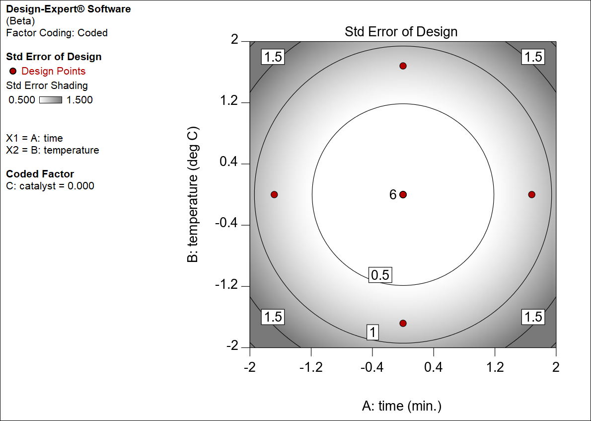
Contour plot of standard error with expanded axes, extrapolated area shaded
As shown in the key, shading begins at one-half standard deviation and increases linearly up to 1.5 times standard deviation. So long as you stay within specified factorial ranges (plus/minus 1), shading remains relatively light — beyond that the plot darkens. Be wary of predictions in these nether regions! Before leaving this sidebar exploration, go back to Graph Preferences and reset both axes to their defaults. Also, change the Process Factors back to their actual levels.
Now on the Graphs Tool click 3D Surface.

3D view of standard error

3D plot of standard error (Y-axis rescaled)
Notice the flat bottom in this bowl-shaped surface of standard error (this bottom plot was created by changing the Y-axis low to 0.4 and high to 0.8). That’s very desirable for an RSM design. It doesn’t get any better than this!