Note
Screenshots may differ slightly depending on software version.
One-Factor Categoric
Part 1 - The Basics
Introduction
In this tutorial you will build a general one-factor multilevel-categoric design using Stat-Ease® software. This type of design is very useful for simple comparisons of categorical treatments, such as:
Who will be the best supplier,
Which type of raw material should be selected,
What happens when you change procedures for processing paperwork.
If you are in a hurry, skip the boxed bits — these are sidebars for those who want to spend more time and explore things.
Note
Response Surface Methods: If you wish to experiment on a continuous factor, such as time, which can be adjusted to any numerical level, consider using response surface methods (RSM) instead. This is covered in a later tutorial.
The data for this example come from the Stat-Ease bowling league. Three bowlers (Pat, Mark, and Shari) are competing for the last team position. They each bowl six games in random order — ideal for proper experimentation protocol. Results are:
Game |
Pat |
Mark |
Shari |
|---|---|---|---|
1 |
160 |
165 |
166 |
2 |
150 |
180 |
158 |
3 |
140 |
170 |
145 |
4 |
167 |
185 |
161 |
5 |
157 |
195 |
151 |
6 |
148 |
175 |
156 |
Mean |
153.7 |
178.3 |
156.2 |
Bowling scores
Being a good experimenter, the team captain knows better than to simply pick the bowler with the highest mean score. The captain needs to know if the average scores are significantly different, given the variability in individual games. Maybe it’s a fluke that Mark’s score is highest.
This one-factor case study provides a good introduction to the power of simple comparative design of experiments (DOE). It exercises many handy features found in the software.
Note
Other resources: We won’t explain all features displayed in this current exercise because most will be covered in later tutorials. Many other features and outputs are detailed only in the help system, which you can access by clicking Help in the main menu, or in most places via a right click, or by pressing the F1 key (context sensitive).
Design the Experiment
Click on File in the main menu and select New Design…, or click the
![]() icon on the toolbar.
icon on the toolbar.

File menu
You now see the design options on the left of your screen. The Factorial category comes up by default. Select Multilevel Categoric for this tutorial.

Multilevel Categoric design
Note
Hard-to-change factors: If any of your factors are quite hard to control, that is, not easily run at random levels, then consider using the Split-Plot Multilevel Categoric design. However, restricting randomization creates big repercussions on the power of your experiment, so do your best to allow all factors to vary run-by-run as chance dictates. (The program by default will lay out your design in a randomized run order.)
Enter the Design Parameters
Leave the number of factors at its default level of 1. Change the orientation to Vertical. Enter Bowler as the name of the factor. Tab to the Units field and enter Person. Leave Type at its default of Nominal. Set the Levels field to 3. Enter Pat, Mark, and Shari for the names of levels 1-3.

Categoric factor entry – Vertical table orientation selected
Note
Screen tips: For details on the options for factor type,
click the light bulb icon (![]() ) in the toolbar to access our
context-sensitive screen tips.
) in the toolbar to access our
context-sensitive screen tips.
In the Replicates field type 6 (each bowler rolls six games). Tab to the “Assign one block per replicate” field but leave it unchecked. The program now recalculates the number of runs for this experiment: 18.

Design options entered
Press Next. Let’s do the easy things first. Leave the number of Responses at the default of 1. Now click on the Name box and enter Score. Tab to the Units field and enter Pins.

Response name dialog box - completed
At this stage you can skip the remainder of the fields and continue on. However, it is good to gain an assessment of the power of your planned experiment. In this case, as shown in the fields below, enter the value 20 for the signal because the bowling captain does not care if averages differ by fewer than 20 pins. Then enter the value 10 for standard deviation (derived from league records as the variability of a typical bowler). The program then computes a signal-to-noise ratio of 2 (20 divided by 10).

Optional power calculator - necessary inputs entered
Press Next to view the happy outcome – power that exceeds 80 percent probability of seeing the desired difference.

Results of power calculation
Click on Finish to create the design and take you to the design layout window.
Save the Design
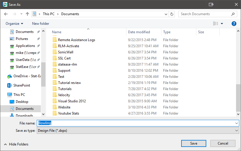
When you complete the design setup, save it to a file by selecting File, Save As…. Type in the name of your choice (for this tutorial, we suggest Bowling) for your data file, which is saved as a *.dxpx type.
Save As dialog box
Click on Save.
Enter the Response Data
When performing your own experiments, you will need to go out and collect the
data. Simulate this by exiting out of the program. Click on Yes if you are
prompted to Save. Now re-start the program and click on Open Design
(or click the open file icon ![]() on the toolbar) to open the data file
you saved before (Bowling.dxpx). You should now see your data tabulated in
the randomized layout. For this example, you must enter your data in the proper
order to match the correct bowlers. To do this, right-click the Std (standard order)
column header and choose Sort Ascending.
on the toolbar) to open the data file
you saved before (Bowling.dxpx). You should now see your data tabulated in
the randomized layout. For this example, you must enter your data in the proper
order to match the correct bowlers. To do this, right-click the Std (standard order)
column header and choose Sort Ascending.

Sort runs by standard order.
Next, right-click the Factor 1 (A: Bowler) column header and choose Sort Ascending.
Note
Quick sorting: You can also sort by just double-clicking on the column header.
Now enter the responses from the following screen. Except for run order, your design layout window must look like that shown below.

Design Layout with response data entered (your random run numbers will differ)
When you conduct your own experiment, be sure to do the runs and enter the response(s) in randomized order. Standard order should only be used as a convenience for entering pre-existing design data.
Save your data by selecting File, Save from the menu (or via the save
icon ![]() on the toolbar). Now you’re backed up in case you mess up your
data.
on the toolbar). Now you’re backed up in case you mess up your
data.
Right-click the top left cell of the table. This allows you to control what the program displays. For this exercise, choose Comments.

Choosing what you wish to display in the design layout
In the comments column above we added a notation that the bowling alley proprietor re-oiled the lane. Keeping run-by-run records like this can be very helpful when diagnosing individual outliers or unexpected shifts in response over the course of your experiment.
Note
Resizing columns: Try this if you like. If comments exceed allotted space, move the cursor to the right border of the column header until it turns into a double-headed arrow. Then, just double-click for automatic column re-sizing.
Now, to better grasp the bowling results, order them from low-to-high as shown below by right-clicking (or double-clicking) the Response 1 column header and selecting Sort Ascending.

Sorting a response column (also works in the factor column)
You’ll find sorting a very useful feature. It works on factors as well as responses. In this example, you quickly see that Mark bowled almost all the highest games.
Analyze the Results

Configuration tab - the starting point for the statistical analysis
Now we’ll begin data analysis. Under the Analysis branch of the program (on the left side of your screen), click the Score node. Press Start Analysis. Tabs appear in the main window on a tool bar. You’ll click these tabs from left to right and perform the complete analysis. It’s a very easy process. The Configure screen gives you the opportunity to select a transformation for the response. This may improve the analysis’ statistical properties.
Configuration tab - the starting point for the statistical analysis
Note
Details on transformations: If you need some background on transformations, first try Tips. For complete details, go to the Help command on the main menu. Click the Search tab and enter “transformations.”
This dataset does not require a transform, so press ahead with the default of None by clicking Start Analysis and then, when it appears, the Effects tab.
Examine the Analysis
By necessity, the tutorial now turns a bit statistical. If this becomes intimidating, we recommend you attend a basic class on regression, or better yet, a DOE workshop such as Stat-Ease’s computer-intensive Modern DOE for Process Optimization.
The program now pops up a very specialized plot that highlights factor A—the bowlers—as an emergent effect relative to the statistical error (that is, normal variation) shown by the line of green triangles.

Initial view of the effect of Bowler
That is good! It supports what was obvious from the raw results—who bowls does matter.
Note
Half-normal plots: If you want to learn more about half-normal plots of effects, work through the Two-Level Factorial Tutorial.
To get the statistical details, press the ANOVA (Analysis of Variance) tab. Notice to the far right side of the ANOVA table that Stat-Ease verifies that the results are significant.

ANOVA results (annotated), with context-sensitive Help enabled via right-click menu
Note
ANOVA annotation: Now select View, Show Annotation from the menu atop the screen and uncheck this option. Note that the textual hints and explanations disappear so you can make a clean printout for statistically savvy clients. Re-select View, Show Annotation to ‘toggle’ back all the helpful hints. Before moving on, try right-clicking on the p-value of 0.0006 as shown above (select Help at the bottom of the pop-up menu). There’s a wealth of information to be brought up from within the program with a few simple clicks: Take advantage!
Now, look to the right side of your screen at the Fit Statistics pane to see various summary statistics.

Summary statistics
Note
Post-ANOVA statistics: The annotations reveal the gist of what you need to know, but don’t be shy about right-clicking on a value and getting online Help (or try the F1 key). In most cases you will access helpful advice about the particular statistic.
Below the Fit Statistics you will find the Coefficients pane.

Coefficient estimates
Here you see statistical details such as coefficient estimates for each model term and their confidence intervals (“CI”). The intercept in this simple one-factor comparative experiment is just the overall mean score of the three bowlers. You may wonder why only two terms, A1 and A2, are provided for a predictive model on three bowlers. It turns out that the last model term, A3, is superfluous because it can be inferred once you know the mean plus the averages of the other two bowlers.
Now let’s move on to the next section within this screen: “Treatment Means.” Click the Treatment Means tab in the ANOVA pane.

Treatment means
Here are the averages for each of the three bowlers. Now click the Treatment Contrasts tab and you’ll see these compared via pair-wise t-tests.

Treatment contrasts
You can conclude from the treatment comparisons that:
Pat differs significantly (24.67 pins worse!) when compared with Mark (1 vs 2)
The 2.5 pins mean difference between Pat and Shari (1 vs 3) is not significant (nor is it considered important by the bowling team’s captain – recall in the design specification for power that a 10-pin difference was the minimum of interest)
Mark differs significantly (22.17 pins better!) when compared with Shari (2 vs 3).
Analyze Residuals
Click the Diagnostics tab to bring up the diagnostic plots. In the layout toolbar, select the single split icon to maximize the normal plot of residuals.

Ideally this will be a straight line, indicating no outlying abnormalities.
Note
The ‘pencil test’: If you have a pencil handy (or anything straight), hold it up to the graph. Does it loosely cover up all the points? The answer is “Yes” in this example – it passes the “pencil test” for normality. You can reposition the thin red line by dragging it or its “pivot point” (the round circle in the middle). However, we don’t recommend you bother doing this – the program generally places the line in the ideal location automatically. If you need to reset the line, simply double-click your left mouse button over the graph.
Notice that the points are coded by color to the level of response they represent – going from cool blue for lowest values to hot red for the highest. In this example, the red point is Mark’s outstanding 195 game. Pat and Shari think Mark’s 195 game should be thrown out because it’s too high. Is this fair? Click this point so it will be selected on this and all the other residual graphs on the Diagnostics Tool (choose how many graphs are displayed at once via the blue layout icons above the Diagnostics tab).

Normal probability plot of residuals (195 game highlighted)
Note
The Diagnostics tool dropdown: Notice on the Diagnostics Tool that they are “studentized” by default. This converts raw residuals, reported in original units (‘pins’ of bowling in this example), to dimensionless numbers based on standard deviations, which come out in plus or minus scale. More details on studentization reside in the Help. Raw residuals can be displayed by choosing it off the down-list on the Diagnostics Tool shown below. Check it out!

Other ways to display residuals
In any case, when runs have greater leverage (another statistical term to look up in the Help), only the Studentized form of residuals produces valid diagnostic graphs. For example, if Pat and Shari succeed in getting Mark’s high game thrown out (don’t worry – they won’t!), then each of Mark’s remaining five games will exhibit a leverage of 0.2 (1/5) versus 0.167 (1/6) for each of the others’ six games. Due to potential imbalances of this sort, we advise that you always leave the Studentized feature checked (as done by default). So if you are on Residuals now, go back to the original choice that came up by default (externally* studentized).
* P.S. Another aspect of how Stat-Ease displays residuals by default is them being done “externally”. This is explored in the Two-Level Factorial Tutorial For now, suffice it to say that the program chooses this form of residual to provide greater sensitivity to statistical outliers. This makes it even more compelling not to throw out Mark’s high game.
Now select the Resid. vs. Pred. tab to view a plot of residuals for each individual game versus what is predicted by the response model.
Note
An apocryphal story: Supposedly, “residuals” were originally termed “error” by statisticians, but the managers got upset at so many mistakes being made!
Let’s make it easier to see which residual goes with which bowler by pressing the down-list arrow for the Color by option in the Diagnostics Tool and selecting A:Bowler.

Residuals versus predicted values, colored by bowler
The size of the studentized residual should be independent of its predicted value. In other words, the vertical spread of the studentized residuals should be approximately the same for each bowler. In this case the plot looks OK. Don’t be alarmed that Mark’s games stand out as a whole. The spread from bottom-to-top is not out of line with his competitors, despite their protestations about the highest score (still highlighted).
Bring up the next graph on the list – Resid. vs Run (residuals versus run number).
Warning
Your graph may differ due to randomization

Residuals versus run chart
Here you might see trends due to changing alley conditions (the lane re-oiling, for example), bowler fatigue, or other time-related lurking variables.
Note
Repercussion of possible trends: In this example, things look relatively normal. However, even if you see a pronounced upward, downward, or shift change, it will probably not bias the outcome because the runs are completely randomized. To ensure against your experiment being sabotaged by uncontrolled variables, always randomize!
More importantly in this case, all points fall within the limits (calculated at the 95 percent confidence level). In other words, Mark’s high game does not exhibit anything more than common-cause variability, so it should not be disqualified.
View the Means and Data Plot
Select the Model Graphs tab to continue the analysis and display a plot containing all the response data and the average value at each level of the treatment (factor). This plot gives an excellent overview of the data and the effect of the factor levels on the mean and spread of the response. Note how conveniently the program scaled the Y axis from 140 to 200 pins in increments of 10.

One-factor effects graph with Mark’s scores in the middle
The squares in this effects plot represent predicted responses for each factor level (bowler). Vertical ‘I-beam-shaped’ bars represent the 95% least significant difference (LSD) intervals for each treatment. Mark’s LSD bars don’t overlap horizontally with Pat’s or Shari’s, so with at least 95% confidence, Mark’s mean is significantly higher than the means of the other two bowlers.
Note
Individual comparisons on the model graph: If you click on one of the boxes at the center of the LSD bars representing the mean (try this!), pairwise comparisons will be graphically displayed. A horizontal line is drawn through the predicted mean of the highlighted point. Any vertical bars that overlap with this horizontal line indicate predicted means that are not significantly different from the selected point. The Pairwise Comparisons Tool spells out which means are significantly different. To return to the default view of LSD bars, click on any open space of the One Factor graph.
Pat and Shari’s LSD bars overlap horizontally, so we can’t say which of them bowls better. It seems they must spend a year in a minor bowling league and see if a year’s worth of games reveals a significant difference in ability. Meanwhile, Mark will be trying to live up to the high average he exhibited in the tryouts and thus justify being chosen for the Stat-Ease bowling team.
That’s it for now. Save your results by going to File, Save (or by
clicking the ![]() icon). You can now Exit if you like,
or keep it open and go on to the next tutorial – part two for general one-factor
design and analysis. It delves into advanced features via further adventures in
bowling.
icon). You can now Exit if you like,
or keep it open and go on to the next tutorial – part two for general one-factor
design and analysis. It delves into advanced features via further adventures in
bowling.
