Avoiding Over-Selection of Effects on the Half-Normal Plot
One of the greatest tools developed by Cuthbert Daniel (1976), was the use of the half-normal plot to visually select effects for two-level factorials. Since these designs generally contain no replicates, there is no pure error to use as the base for statistical F-tests. The half-normal plot allows us to visually distinguish between the effects that are small (and normally distributed) versus large (and likely to be statistically significant). The subsequent ANOVA is built on this decision to split the effects into the few that are likely “signal” versus the majority that are likely “noise”.
Often the split between the groups is obvious, with a clear gap between them (see Figure 1), but sometimes it is more ambiguous and harder to decide where to “draw the line” (see Figure 2).
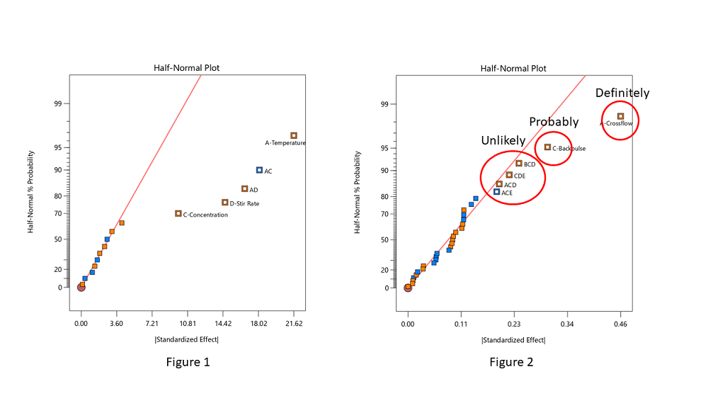
Stat-Ease consultants recommend staying conservative when deciding which effects to designate as the “signal”, and to be cautious about over-selecting effects. In Figure 2, the A effect is clearly different from the other effects and should definitely be selected. The C effect is also separated from the other effects by a “gap” and is probably different, so it should also be included in the potential model terms. The next grouping consists of four three-factor interactions (3FI’s.) Extreme caution should be exercised here – 3FI terms are very rare in most production and research settings. Also, they fall “on the line”, which indicates that they are most likely within the normal probability curve that contains the insignificant effects. These terms should be pooled together to estimate the error of the system. The conservative approach says that choosing A and C for the model is best. Adding any other terms is most likely just chasing noise.
Hints for choosing effects:
- Split the effects into two groups, distinguishing between the “big” and “small” ones, right versus left, respectively
- Start from the right side of the graph – that is where the biggest effects are
- Look for gaps that separate big effects from the rest of the group
- STOP if you select a 3FI term – these are very unlikely to be real effects (throw them back into the error pool)
- Don’t skip a term – if a smaller effect looks like it could be significant, then all larger effects also must be included
- Effects need to “jump off” the line – otherwise they are just part of the normal distribution
Sometimes you have to simply accept that the changes in the factor levels did not trigger a change in the response that was larger than the normal process variation (Figure 3). Note in Figure 3 that the far right points are straddling the straight line. These terms have virtually the same size effect – don’t select the lower one just because it is below the line.
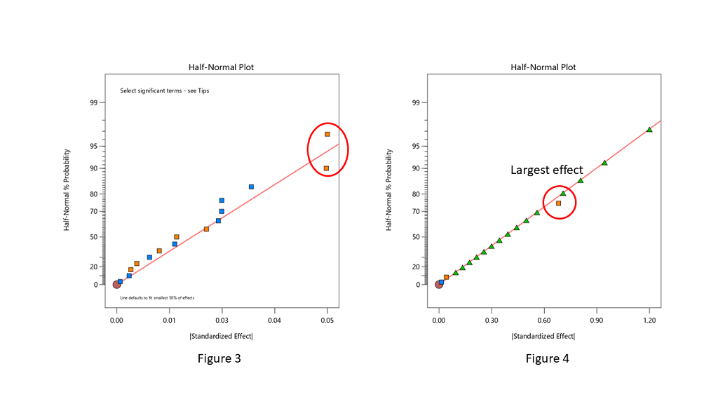
When you are lucky enough to have replicates, the pure error is then used to help position green triangles on the half-normal plot. The triangles span the amount of error in the system. If they go out farther than the biggest effect, that is a clear indication that there are no effects that are larger than the normal process variation. No effects are significant in this case (see Figure 4).
Conclusion
The half-normal plot of effects gives us a visual tool to split our effects into two groups. However, the use of the tool is a bit of an art, rather than an exact science. Combine this visual tool with both the ANOVA p-values and, most importantly, your own subject matter knowledge, to determine which effects you want to put into the final prediction model.